Ein Dashboard-Element ist eine Dashboard-Komponente (manchmal auch als „Kachel“ bezeichnet). Bei diesem Dashboard-Element kann es sich um einen Zähler, eine Tabelle, ein Diagramm (Balken-, Kreis- oder Ringdiagramm) oder eine Karte handeln. Jedes Dashboard kann ein oder mehrere Elemente enthalten. Elemente verfügen über eigene, einheitliche Steuerelemente. Die Daten der Elemente können angezeigt, angepasst, hinzugefügt, entfernt, sortiert und exportiert werden.
 Dashboard-Element anpassen
So passen Sie ein Dashboard-Element an:
-
Klicken Sie oben rechts im Dashboard-Element auf das Symbol Anpassen (
 ):
):
-
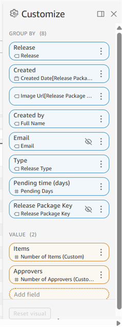
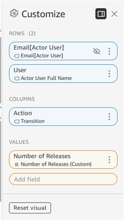
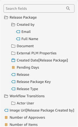
Eine Palette auf der rechten Seite öffnet sich und zeigt alle Daten unter Gruppieren nach oder Zeilen und Spalten (in Blau) sowie Werte (in Orange) an. Die Felder sind unter den einzelnen Anpassungskategorien aufgelistet.
-
Klicken Sie in einem Feld auf das Überlaufmenü, um die folgenden Optionen anzuzeigen. Nicht alle Optionen sind für alle Felder verfügbar.
-
Sortieren nach: Gruppe, nach der das Dashbord-Element zuerst sortiert ist.
-
Sortierreihenfolge: Aufsteigend oder Absteigend
-
Aggregieren: So werden die Daten aggregiert: Sekunde, Minute, Stunde, Tag, Woche, Monat, Quartal, Jahr.
-
Anzeigen als: Zahl, Währung, Prozent.
-
Format: Zahlenformat (mit oder ohne Kommas und Dezimalstellen).
-
Ausblenden: blendet die aktuelle Gruppe, Zeile oder Spalte aus
-
Alle ausgeblendeten Felder anzeigen: Wenn Felder auf ausgeblendet gesetzt sind, werden sie dadurch alle sichtbar.
-
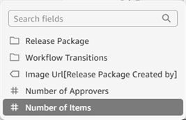
Ersetzen: ersetzt das aktuelle Feld durch ein alternatives Feld. Wenn diese Liste lang ist, verwenden Sie das Suchfeld, um das Feld zu finden:
-
Entfernen: löscht die aktuelle Gruppe, Zeile oder Spalte.
-
-
Klicken Sie unten im Bedienfeld Anpassen auf die Schaltfläche Dashboard-Element zurücksetzen, um alle Anpassungen auf ihre Standardwerte zurückzusetzen. Klicken Sie alternativ oben rechts im Bildschirm auf das Symbol Auf Original-Element zurücksetzen (
 ), um das Dashboard-Element auf die Standardeinstellungen zurückzusetzen:
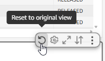
-
Klicken Sie unten in der Anpassen-Palette auf die Option Feld hinzufügen, um nach einem neuen Feld zu suchen und ein neues Feld zum Dashboard-Element hinzuzufügen:
Dashboard-Element maximieren/minimieren
Klicken Sie oben rechts im Bildschirm auf das Symbol für Maximieren/Minimieren ( /
/ ), um das Bild über die gesamte Breite des Bildschirms zu öffnen (maximieren) oder es auf seine Originalgröße zu reduzieren (minimieren):
Wenn das Dashboard-Element bereits die Breite des Bildschirms hat, passiert beim Maximieren gar nichts.
Datenanordnung in Dashboard-Elementen
So ändern Sie die Reihenfolge, in der die Daten des aktuellen Dashboard-Elements angezeigt werden:
-
Klicken Sie oben rechts im Dashboard-Element auf das Symbol für Element sortieren (
 ):
):
-
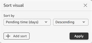
Das Dialogfenster für die Anordnung der Daten innerhalb des Dashboard-Elements wird geöffnet. Klicken Sie auf das Dropdown-Menü „Sortieren nach“, um eine Spalte auszuwählen, nach der die Tabellendaten sortiert werden sollen. Geben Sie in der rechten Dropdown-Liste an, ob die Sortierung auf- oder absteigend sein soll:
-
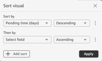
Klicken Sie auf die Schaltfläche Sortierung hinzufügen, um eine weitere Sortierung zur Liste hinzuzufügen. Damit lässt sich die Tabellensortierung weiter verfeinern:
-
Wenn Sie fertig sind, klicken Sie auf Anwenden.
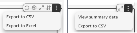
Daten von Dashboard-Elementen als CSV- oder Excel-Datei exportieren
Tabellen-Dashboard-Elemente können als CSV- oder Excel-Datei exportiert werden. Daten von Zählern, Diagrammen oder Karten lassen sich nur als CSV-Datei exportieren. So exportieren Sie die Daten eines Dashboard-Elements:
-
Klicken Sie oben rechts im Dashboard-Element auf das Überlaufsymbol (
 ):
):
Überlaufmenü bei einer Dashboard-Tabelle (links) und bei einem Dashboard-Diagramm (rechts)
-
Klicken Sie entweder Als CSV exportieren oder auf Als Excel exportieren.
-
Die Datei wird erstellt und auf das verbundene Gerät heruntergeladen. Sie sehen eine Meldung, wenn die Datei erstellt wird (CSV/Excel-Datei wird bearbeitet) und eine weitere Meldung, wenn die Datei heruntergeladen wurde (CSV/Excel-Datei bereit). Klicken Sie auf das X, um diese Meldungen zu schließen.
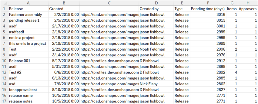
Beispiel für einen CSV-Export, geöffnet in Microsoft Excel
Beim Exportieren als CSV- oder Excel-Datei wird der komplette Datensatz gesendet. Die Paginierungseinstellungen einer Tabelle haben darauf keinen Einfluss. Weitere Informationen zu den Exportbeschränkungen von Daten aus Dashboard-Elementen finden Sie unter Daten von Dashboard-Elementen exportieren.
Zusammenfassende Daten anzeigen (Zähler-, Diagramm- oder Karten-Elemente)
Zum Anzeigen der zusammenfassenden Daten werden Diagramm- oder Kartendaten aus Dashboard-Elementen in eine Tabelle umgewandelt, die in einem modalen Dialogfenster geöffnet wird. So zeigen Sie die zusammenfassenden Daten an:
-
Klicken Sie oben rechts im Dashboard-Element auf das Überlaufsymbol (
) und wählen Sie Zusammenfassende Daten anzeigen aus: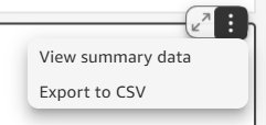
-
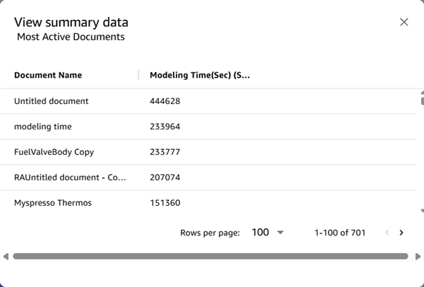
Die Daten werden in einem modalen Dialogfenster geöffnet, in dem Sie die folgenden Aktionen ausführen können:
-
horizontal (nach unten) oder vertikal (nach rechts) scrollen, um sich die Daten näher anzusehen
-
auf eine Spaltenüberschrift klicken, um die Daten in dieser Spalte auf- oder absteigend zu sortieren
-
auf den Dropdown-Pfeil Zeilen pro Seite klicken, um die Anzahl der pro Seite anzuzeigenden Einträge auszuwählen: 25, 50 oder 100
-
zwischen den Seiten navigieren, indem Sie unten rechts auf die Pfeile für „Vorherige Seite/Nächste Seite“ rechts neben der Anzahl der Seitenzeilen klicken
-
Zähler
Ein Zähler-Dashboard-Element zeigt einen einzelnen aggregierten Datenwert an. Dies kann eine Gesamtzahl (z. B. Mitglieder gesamt oder Geöffnete Dokumente) oder ein Zeitrahmen (z. B. Modellierungszeit) sein.
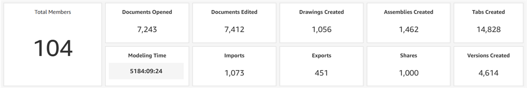
Beispiel für Zähler-Elemente aus dem Dashboard „Audit > Enterprise-Status“.
Wenn Zähler-Elemente im Dashboard verwendet werden, befinden sie sich normalerweise oben vor allen anderen Dashboard-Elementen.
Tabellen
Tabellen sind das am häufigsten verwendete Dashboard-Element. Sie zeigen Daten in Zeilen und Spalten an.
Tabellendaten anpassen
Wenn Sie auf die Überschrift einer Tabellenspalte klicken, wird ein Kontextmenü geöffnet. Dort lassen sich die zugrunde liegenden Tabellendaten anpassen. Einige dieser Optionen sind auch in der Anpassungspalette verfügbar. Nicht alle Optionen sind für alle Felder verfügbar.
- Sortieren nach: Gruppe, nach der das Dashbord-Element zuerst sortiert ist.
-
Sortierreihenfolge: Aufsteigend oder Absteigend
-
Aggregieren: So werden die Daten aggregiert: Sekunde, Minute, Stunde, Tag, Woche, Monat, Quartal, Jahr.
-
Anzeigen als: Zahl, Währung, Prozent.
-
Format: Zahlenformat (mit oder ohne Kommas und Dezimalstellen).
-
Ausblenden: blendet die aktuelle Gruppe, Zeile oder Spalte aus
-
Alle ausgeblendeten Felder anzeigen: Wenn Felder auf ausgeblendet gesetzt sind, werden sie dadurch alle sichtbar.
-
Nach links: verschiebt die aktuelle Spalte nach links
-
Nach rechts: verschiebt die aktuelle Spalte nach rechts
-
Spalte fixieren: setzt die Spalte auf der linken Seite der Tabelle fest, wodurch die Spalte beim horizontalen Scrollen an Ort und Stelle bleibt.
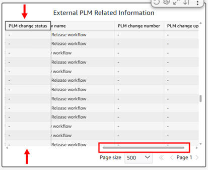
Beispiel: Die Spalte „PLM-Änderungsstatus“ ist fixiert. Wenn die horizontale Bildlaufleiste verwendet wird, bleibt diese Spalte unverändert an derselben Stelle.
-
Bis zu dieser Spalte einfrieren: fixiert alle Spalten links von der aktuellen Spalte, einschließlich dieser.
-
Ersetzen: ersetzt das aktuelle Feld durch ein alternatives Feld. Wenn diese Liste lang ist, verwenden Sie das Suchfeld, um das Feld zu finden:
-
Entfernen: löscht die aktuelle Gruppe, Zeile oder Spalte.
-
Anpassen: öffnet das Anpassungsfenster.
-
Grafik zurücksetzen: setzt alle Anpassungen auf ihre Standardwerte zurück. Alternativ können Sie auf das Symbol Auf ursprüngliche Ansicht zurücksetzen (
) in der oberen rechten Ecke der Grafik klicken, um die Ansicht der Grafik auf die Standardeinstellungen zurückzusetzen:
Wenn alle Spalten innerhalb der Breite der Ansicht sichtbar sind, hat das Einfrieren keine Wirkung.
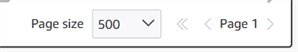
Tabellen-Paginierung
Bei einigen Tabellen befinden sich die Angaben Seitengröße und Seitenzahl in der unteren rechten Ecke der Grafik. Standardmäßig werden die ersten 500 Tabelleneinträge in einer Grafik angezeigt:
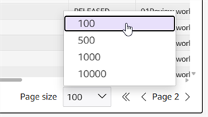
Die Seitengröße kann so angepasst werden, dass 100, 500, 1.000 oder 10.000 Einträge pro Seite angezeigt werden. Klicken Sie auf den Dropdown-Pfeil, um die Anzahl der pro Seite anzuzeigenden Einträge auszuwählen. Klicken Sie auf die Pfeile rechts oder links neben der Seitenzahl, um zur nächsten bzw. zur vorherigen Seite zu wechseln.
Diagramme
Kreisdiagramme
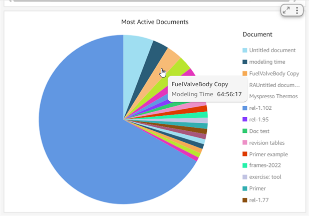
Bewegen Sie den Mauszeiger über die Segmente des Kreisdiagramms, um detaillierte Informationen anzuzeigen:
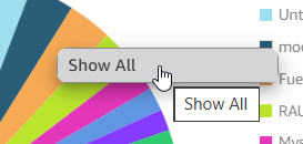
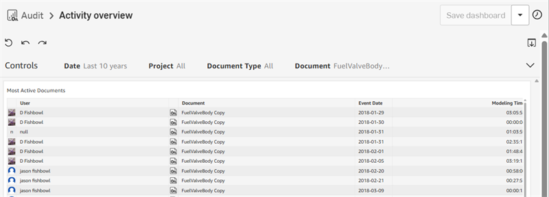
Klicken Sie auf ein beliebiges Segment und anschließend auf Alle anzeigen (erstes Bild unten). Daraufhin werden die Daten dieses Segments in Tabellenform angezeigt (zweites Bild unten):
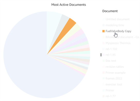
Klicken Sie auf den Eintrag in der Segmentlegende, um nur dieses Segment im Kreisdiagramm anzuzeigen, während alle anderen Segmente ausgeblendet werden:
Klicken Sie auf und ziehen Sie die Trennlinien ( ), um den Abstand zwischen dem Kreisdiagramm und der Legende anzupassen:
Balkendiagramme
Ein vertikales oder horizontales Balkendiagramm funktioniert ähnlich wie ein Kreisdiagramm, allerdings werden die anderen Daten beim Klicken auf einen Balken nicht abgeblendet. Wenn Sie mit der Maus über einen Balken fahren, werden dessen Daten angezeigt. Durch Klicken auf einen Balken wird ein Kontextmenü mit zusätzlichen Optionen aufgerufen, mit denen Sie die Daten des Balkens weiter aufschlüsseln können:
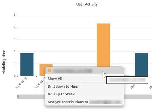
Balkendiagramm der Benutzeraktivität, mit zusätzlichen Optionen.
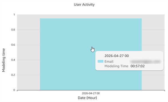
Wenn Sie auf „Nach Stunde aufschlüsseln“ klicken, werden die stündlichen Daten vergrößert angezeigt.
Neben den Optionen Alle anzeigen (wie bei tabellarischen Daten) und Beiträge analysieren stehen in der aktuellen Leiste weitere Optionen zur Verfügung.
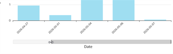
Ziehen Sie an einem der beiden Enden des Datenbalkens auf der X-Achse, um den im Diagramm angezeigten Bereich anzupassen. Im folgenden Balkendiagramm wird beispielsweise der Datumsbereich angepasst:
Klicken Sie auf und ziehen Sie die Trennlinien ( ), um den Abstand zwischen dem Balkendiagramm und der Legende anzupassen:
Ringdiagramm
Ringdiagramme ähneln Kreisdiagrammen, mit dem Unterschied, dass die Daten als Ring in Form eines Donuts dargestellt werden. Die Gesamtwerte werden in der Mitte angezeigt, während die Teilwerte im Ring dargestellt werden. Wenn Sie die Maustaste über ein Ringsegment bewegen, werden die Zahlen für dieses Segment angezeigt, wie unten dargestellt:
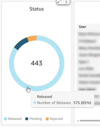
Beispiel für ein Ringdiagramm mit Gesamtstatusanzahl: 443 (Mitte) und Anzahl der Freigaben: 375 (blauer Abschnitt)
Abbildungen
Die Kartenansicht zeigt Standortdaten auf einer Weltkarte an. Klicken und ziehen Sie, um die Karte neu zu positionieren und bestimmte Regionen anzuzeigen. Verwenden Sie die Zoom-Symbole „+“ und „-“ auf der Karte, um die Ansicht zu vergrößern oder zu verkleinern.
Kartenansichten sind derzeit für Onshape Government (US)-Abonnements nicht verfügbar
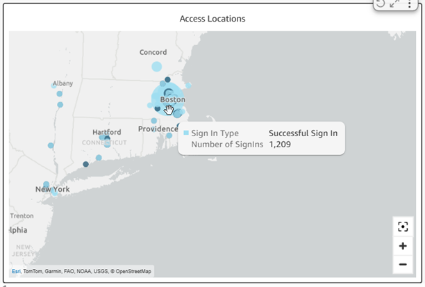
Mauszeiger über einen Kartenpunkt bewegen
Klicken Sie auf einen Punkt auf der Karte, um Informationen zu den Aktivitäten an diesem Standort anzuzeigen. Klicken Sie auf die Informationen, um eine Palette mit detaillierteren Angaben zu öffnen. Wenn Sie beispielsweise unten auf Fehlgeschlagene Anmeldungen anzeigen klicken, öffnet sich eine neue tabellarische Palette mit den entsprechenden Anmeldeinformationen sowie Spalten für Land, Stadt, Veranstaltungsdatum, IP-Adresse, Sitzungs-ID und Benutzer.
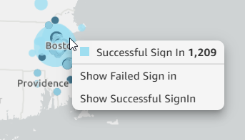
Klicken Sie auf einen Kartenpunkt, um weitere Dashboards aufzurufen.