Render Studio Interface
Only available for
The sections below explain how each area of the Render Studio tab's interface works. Create multiple Render Studio tabs, each containing a dashboard with a number of Render Studio scenes.
 Dashboard
Each Render Studio tab contains a single dashboard, where scenes are listed and organized. From the dashboard, create new and open, update, or delete saved Render Studio scenes. Save any number of scenes in each dashboard. Each scene is stored only in the tab/dashboard where it is created.
Accessing the dashboard
Once scenes are created following the basic workflow, there are two ways to access the dashboard:
-
If on another tab in the document, click the Render Studio tab.
-
If in a scene, at the far right of the toolbar, click the Return to dashboard
 icon.
icon.
The dashboard is outlined below:
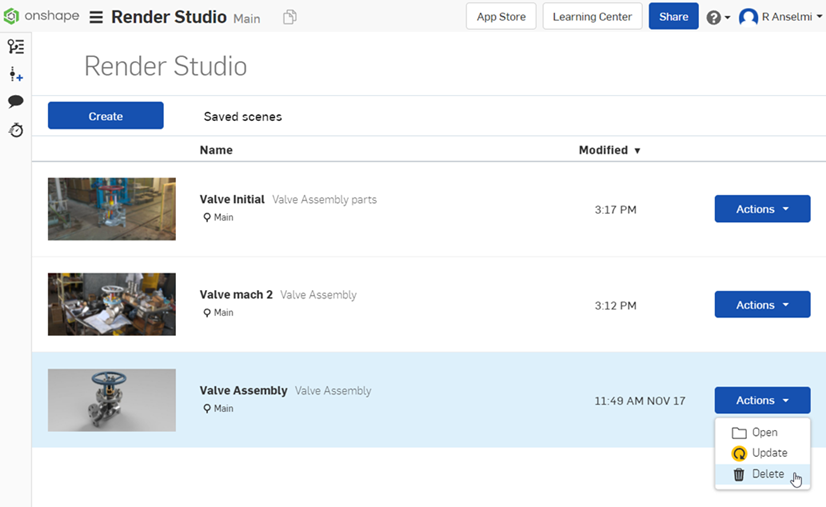
Create - Click the Create button to start a new scene. The Scene creation dialog opens:
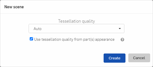
Select the appropriate Tessellation quality. Options are Auto, Coarse, Medium, Fine, or Custom. Coarser tessellation creates the scene faster, but with lower quality. Finer tessellation creates the scene slower, but with higher quality. Auto selects tessellation based on the complexity of the parts brought into a Render Studio. More complex parts have coarser tessellation and less complex parts have finer tessellation. If unsure, use the Auto tessellation option.
If Use tessellation quality from part(s) appearance is checked, tessellation is applied according to how each part's tessellation quality is set in the Appearance dialog in the Part Studio. If part tessellation is not set (or set to "Auto") in the Appearance dialog in the Part Studio, the Tessellation quality setting in the New scene dialog is used. See Specifying tessellation quality of parts for more information.
If importing an Assembly that has one or more exploded views, a prompt opens with an additional dialog dropdown, where an Exploded view is selected and used as the basis for the new scene:
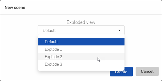
If a Render Studio scene is open, and is based on an Assembly with associated exploded views, access and switch the scene's Assembly instance to any one of these exploded views under the View tools.
Thumbnail - View a thumbnail of the scene on the left side of the panel.
Name - Displays the scene name in bold, the Part Studio or Assembly from which the scene was derived, and the version below the name. Click the scene name link to open the scene.
Modified - Displays the time and date the scene was last updated.
Actions - Click the Actions button on the right side to open up the following commands:
-
Open - Opens the selected scene.
-
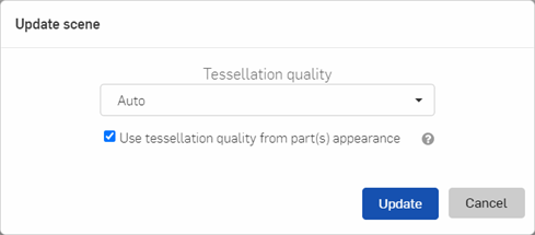
Update - Updates the scene. Any changes made to the model in the Part Studio or Assembly are first applied before the scene is tessellated. When clicked, the Update scene dialog opens. Select the Tessellation quality for the updated scene, and whether or not to use the tessellation quality from part appearance (explained above). Then click Update to open the updated scene, or click Cancel to cancel the update process and return to the dashboard.
If updating an Assembly with one or more exploded views, the dialog contains an additional Exploded view dropdown. Select any one of the exploded views to use as athe basis for the updated scene. This does not necessarily need to be the same exploded view from which the scene originated.
-
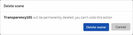
Delete - Opens a confirmation dialog to confirm deletion of the scene. Click Delete scene to confirm, or Cancel to keep the scene.
Saving a scene to the dashboard
Once the scene is edited, save it to the dashboard:
-
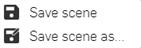
From the toolbar, click the Save scene
 icon to save the current scene. To instead save a copy of the current scene to a new scene, click the Save dropdown arrow and select Save scene as.
-
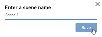
The Save dialog opens. Enter a scene name and click the Save button. The scene is saved to the dashboard:
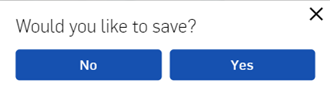
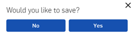
An alternate method to save the scene is to click the Return to dashboard
icon. A prompt opens to ask if the scene should be saved (shown in the image below). Click Yes. The Save dialog from step 2 above opens. Enter a scene name and click the
Save
button.
Toolbar
Located at the top of the page, the toolbar contains several commands that are commonly performed when working in Render Studio:

-
 Undo
- Cancels the last performed operation. The document is restored to a state before this operation took place. Continue to undo previous operations in backward succession.
Undo
- Cancels the last performed operation. The document is restored to a state before this operation took place. Continue to undo previous operations in backward succession.
-
 Redo
- Repeats the last performed operation.
Redo
- Repeats the last performed operation.
-
Save scene
- Saves the current Scene or a copy of the current Scene to the Render Studio dashboard. When selected, the following submenu opens:
-
Width - Displays the width of the current scene.
-
Height - Displays the height of the current scene.
-
 Edit options
- Set the options for the current scene. When selected, the following Selection panel submenus are available:
Edit options
- Set the options for the current scene. When selected, the following Selection panel submenus are available:
-
Progressive rendering - Parameter that determines how the scene renders:
-
Max Samples - Maximum number of samples, after which rendering stops.
-
-
Matte fog - Create additional Matte fog parameter options:
-
Enabled - Enables the matte fog effect.
-
Visibility range - Specifies the matte fog visibility range, in meters, that is the distance at which the contrast between bright and dark objects is still perceivable, according to the Koschmieder equation. This value takes the conversion of scene to metric units into account (mdl_meters_per_scene_unit).
-
Visibility tint - Varies the visibility range per color channel.
-
Brightness - Specifies the brightness of the in-scattered lighting, either as an absolute value, or as a multiplier (see Brightness relative to environment below).
-
Brightness relative to environment - If enabled, the brightness of the in-scattered lighting is automatically determined to be relative to the total luminance of the environment or sun and sky. If disabled, the brightness is an absolute value.
-
Brightness tint - Color tint option for in-scattered lighting.
-
-
Filtering - Iray Photoreal filter parameters:
-
Pixel filter - Iray Photoreal natively supports Box, Triangle and Gauss filters for anti-aliasing. These filters affect the way multiple samples are combined into a single pixel. Gauss gives smoother results, Triangle gives sharper results, and Box is only useful in specific situations.
-
Pixel filter radius - The filter kernel radius. Recommended values are 0.5 for Box filter, 1 for Triangle filter, and 1.5 for Gauss filter.
-
-
Bloom filter - See Add and adjust a bloom filter.
-
AI denoiser - controls the Deep Learning-based denoiser that uses Artificial Intelligence to remove noise from rendered images, predicting what the image should look like in a more finished state, without waiting on the final render:
-
Available to use - Enables the AI denoiser. This option does not cause any changes in the output image, It instead triggers generation of all additional data needed, so it is available to denoise later during a progressive render. If enabled, this option may incur a small memory and performance overhead. Disable if denoise is not desired.
-
Enabled - If enabled, the AI denoiser processes the rendered image. If the denoiser is not available, this option has no effect. It is not necessary to re-start the progressive render of an image when changing this option. The next frame of the image is produced with the selected value applied. Enabling the denoiser may consume significant memory and performance.
-
Start iteration - If the denoiser is enabled, this option sets the start point for the denoise operation. Denoise is not performed for any iteration below this value. This prevents the denoiser's performance overhead from impacting interactivity (for example, when moving the camera). Additionally, the first few iterations are often not suitable as input for the denoiser due to insufficient convergence, leading to unsatisfactory results.
-
Denoise alpha - If enabled, the alpha channel of the RGBA image is denoised; otherwise, it is left unchanged. Checking this setting approximately double the time needed for the denoise operation.
-
-
Iray photoreal - Create additional Iray photoreal parameter options:
-
Shadow terminator offset mode - Fix shadow terminator artifacts (jagged shadows) for poorly tessellated geometry. Override the per-object Boolean attribute shadow_terminator_offset globally for all scene objects. Possible values are off, on, and user (the latter always uses the per-object attribute). It is not recommended to always have this on, as it can lead to other shadowing problems in some geometric setups.
-
Maximum path length - Bounds the maximum number of vertices (bounces) of light paths that contribute to the result. Since this setting cuts off indirect lighting contributions (one example would be the headlight of a car that depends on a lot of indirect effects to look correct), it should only be applied when the rendering must be accelerated at the expense of physical accuracy.
-
-
White mode - See White mode.
-
Instancing - Create additional Instancing parameter options:
-
Instancing - Controls the handling of multiple instances of objects and whether or not they are duplicated in memory.
-
-
Spectral rendering - Create additional Spectral rendering parameter options:
-
Enabled - Enables spectral rendering.
-
Conversion color space - The color space in which the conversion of color data to spectra is defined for the rendering core. Supported color spaces are CIE XYZ, Rec.709/linear sRGB, Rec.2020, and ACES.
-
Conversion intent - Guides the color space conversions toward either a Natural conversion, where smoothness is preferred over reflectivity, or Faithful, where smoothness is traded off to yield greater compatibility with color rendering.
-
Output transform - The transform applied to the color result. For example, this can be used to transform to a desired result color space. The default transforms from CIE XYZ to Rec.709/linear sRGB.
-
Observer - By default, the photometric rendering mode uses the CIE 1931 2 degree standard observer as color matching functions. Set this option to CIE 1964, and the color matching functions are changed to the CIE 1964 10 degree standard observer.
-
-
Matte - Create additional Matte parameter options:
-
Area lights visible - By default, matte area lights are not visible (neither directly nor in reflections) since in a matte workflow those paths should evaluate to the backplate or the environment. Enabling this setting makes the matte area lights visible.
-
Shadow affects alpha - If enabled (default), shadows received by matte objects makes the alpha channel of the output canvas opaque. Otherwise, matte shadows do not affect the alpha channel.
-
Visible in auxiliary canvas - When set to true, all matte objects (including the implicit dome ground plane) show up in any auxiliary render canvas like texture_coordinate, object_id, or distance.
-
Remap uv to dome in auxiliary canvas - If enabled, all matte objects (including the implicit dome ground plane) feature special texture coordinates written into the texture_coordinate canvas. These can be used for the actual uv-mapping into a spherical environment texture map.
-
-
Special samplers - Create additional Special samplers parameter options:
-
Caustic sampler - Enables the caustic sampler. Refer to Iray documentation for more information.
-
Guided sampling - The Iray Photoreal automatic guided sampling is used to improve both the quality of rendering (especially if the caustic sampler is disabled and/or the firefly filter enabled), as well as the rendering convergence speed (when rendering a complicated scene, such as large interiors). When enabled, Iray Photoreal augments the default sampler with a dedicated guidance cache, designed to improve the convergence of complicated light transport scenarios. The guided sampler does not improve convergence speed in all use cases, and thus can actually harm overall rendering performance as it comes with some performance overhead. Refer to Iray documentation for more information.
-
-
Sections - Determines the parameters for clipped geometry:
-
Caps enabled - Enables capping of clipped geometry. If this mode is enabled, solid areas cut open by a section object are closed with a virtual surface. The normal orientation is used to determine which parts of an object to cap. Shading and geometry normals must be oriented in a consistent fashion.
-
Caps color - Controls the diffuse color of the material that is applied to section caps.
-
-
-
 Environment and ground
- Opens a dialog to edit the Environment and ground for your scene:
Environment and ground
- Opens a dialog to edit the Environment and ground for your scene:
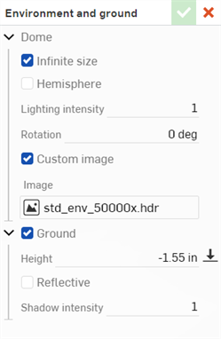
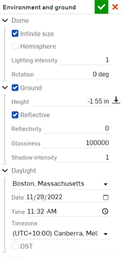
Edit the following Dome parameters:
-
Infinite size - Sets the environment to an infinitely sized dome. In this environment the horizon is so far away that the position of the camera in the scene has no effect, only the direction the camera is looking. This is appropriate for exterior scenes. When not using an infinite environment, a distance to the horizon (Horizon distance) must be provided. This is more appropriate for interior scenes or contained exterior scenes where the position of the camera and not just the orientation should affect the view of the environment.
-
Horizon distance - The distance from the center of the environment to the horizon.
-
-
Hemisphere - Sets the environment to hemispherical. A hemispherical environment has the ground at the base of the hemisphere projected from the lighting environment. This can be useful when you want the scene to stick to the ground rather than float within the environment. When enabled, set the Tripod height to your specification.
-
Tripod height - The height of the camera above the ground when the environment image was captured. This is used to project the lower portion of the environment dome onto a flat ground plane.
-
-
Lighting intensity - Multiplier for the intensity of the lighting contained within the environment image. Values of less than 1 reduce the brightness of the lighting from the environment while values greater than 1 increase it.
-
Rotation - Rotation of the environment dome about the vertical axis.
-
Custom image - Override the environment dome with a user provided HDRI environment image. Images should be in 360/180 degree latitude/longitude and ideally in .hdr or .exr format. See Adding a custom Environment to the scene for further information.
-
Image - Custom HDRI lighting environment image.
-
Edit the following Ground parameter, which enables the virtual ground plane (enabled by default):
-
Height - The height at which the ground plane is positioned. By default, the ground is automatically positioned at the lowest point in the scene. Set the Height parameter to your specification. Click the downward arrow icon to reset the ground height to the lowest point.
Edit the following Reflective parameters, which allows the ground plane to reflect the scene:
-
Reflectivity - Amount of reflectivity of the ground plane.
-
Glossiness - Glossiness of the ground plane. Higher numbers give a mirror-like reflection. Lower numbers blur the reflection.
-
Shadow intensity - Intensity of shadows on the ground. A value of 1 gives the physically correct result. Values less than 1 give lighter shadows, while values greater than 1 give darker shadows.
Edit the following Daylight parameters (available for some Environments, such as Preetham):
-
City - Select from a list of major world cities.
-
Date - Select year and date numerically by clicking on the month, day, and year directly, or click the calendar icon to select a date from the pick list.
-
Time - Select a time numerically by clicking on the hour, minute, and AM / PM designation, or click the clock icon to select from the time pick list.
-
Timezone - Select from a list of UTC timezones.
-
DST - When checked, adjustment is made for daylight saving time.
-
-
 Render to Onshape
- Renders the current scene to a tab in Onshape, or to disk (saved to the Documents folder on the local computer).
Render to Onshape
- Renders the current scene to a tab in Onshape, or to disk (saved to the Documents folder on the local computer).
-
 Help
- Opens dynamic Help balloons which navigates through a brief tour of the Render Studio interface, or the About dialog, which displays the Render Studio version number:
Help
- Opens dynamic Help balloons which navigates through a brief tour of the Render Studio interface, or the About dialog, which displays the Render Studio version number:
-
Return to Dashboard
- Closes the current Render Studio and returns to the Render Studio dashboard. If the current scene is unsaved, a dialog opens prompting to save or discard the scene. To save the scene, enter a name and click the
Yes
button. Otherwise, click
No:
Daylight parameters are only available for certain environments (for example, Perez and Preetham). See Editing an Environment with location and time

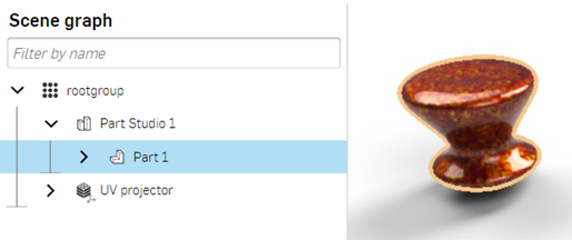
Scene graph
Located on the left side of the page, the scene graph provides Part Studio and/or Assembly information for the current Render Studio scene.
When an option in the Scene graph is selected, the Selection and Appearance panels to the right display lists of related submenus and their editable parameters. See the Selection and Appearance panel sections for a comprehensive list of parameter options.
Appearance and Selection panel options are only available if a single Scene graph list item is selected. Multiple selected options prompt the "Multiple objects selected" message in either panel.
Only Part Studios, Assemblies, Parts, and Faces can be multiple selected (selected together in a grouped selection). If another object is selected, such as uv_projector, the Part Studios, Assemblies, Parts and/or faces are deselected, and the new object selected. All other settings in the Scene graph are single selections.
To adjust the Scene graph panel width, hover the cursor over a panel edge. When the cursor turns into a double-sided arrow, click and drag to resize the panel.
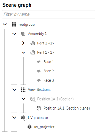
Scene graph hierarchy
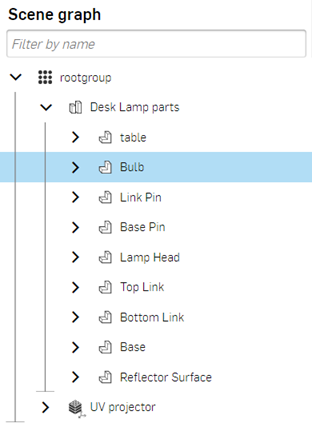
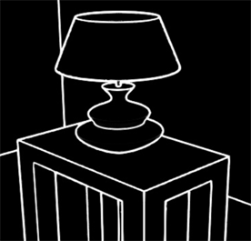
The Scene graph has a hierarchical approach to the scene, and can be thought of in terms of levels. For example, in the image below, rootgroup is the top level, Desk Lamp parts is one level below the rootgroup, and Bulb is a part that is one level below the Desk Lamp parts.
This concept of levels is important when it comes to setting precedence. A property on a level at the top takes priority over all levels below. If no property is set at the top level, but is set at the next level below, that property takes priority, and its property is applied to all lower levels. The exception to this rule is if a property at a higher level has an override set. If an override is set, then all levels below are overridden and will instead use this top level property. See Set a parameter override for more information.
For example, in the image below, if the Desk Lamp parts has a property set, then all elements below (table and Bulb, for example) use this property. If, on the other hand, the Desk Lamp parts does not have its property set, but Bulb has, then the property set at Bulb is used for all levels below. If an override exists in a level further up (for instance, on Desk Lamp parts), then this property setting takes priority over anything set below its level (table and Bulb for example), even if any of them have their property set.
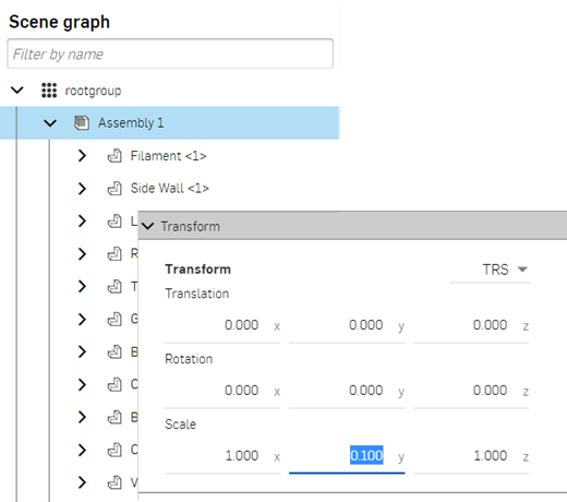
Elements in a Scene graph cannot move from one layer to another (i.e.: up or down in the Scene graph). The transform matrix, which determines where in space an item is located, is stored with the element (as an element instance). These transforms accumulate as they are added to each element. Transform the top level element, and all lower level elements transform accordingly; they are moved together as a group.
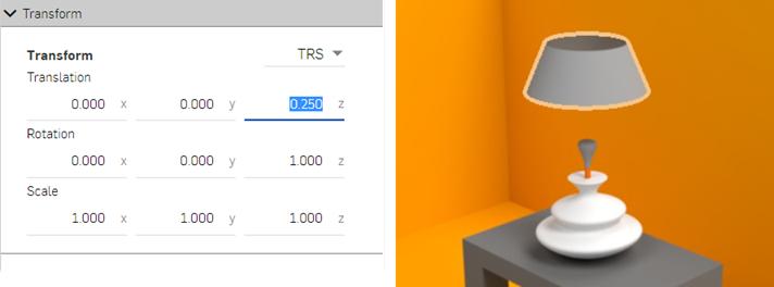
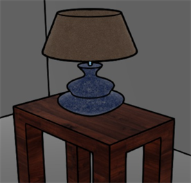
For example, select the Part Studio or Assembly in the Scene graph (Assembly 1 in the first image below), and scale the y axis from 1.000 to 0.100 in the Selection panel's Transform submenu. All parts of the Assembly are scaled down together (shown in the second image below):
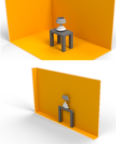
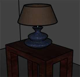
For comparison, if one part in the Assembly is selected (the lamp shade here), and the Transform menu used to alter the z axis positively, only the shade moves up in the scene:
See Transform options for more information on part, Part Studio, and Assembly transforms.
Scene graph icons
| Icon | Description |
|
Parent group (rootgroup or Section view group) |
|
Part Studio |
|
|
Assembly or subassembly |
|
Part or surface |
|
Face (mesh) |
|
Section view (plane) |
|
Section view instance |
|
UV projector |
|
UV projector instance |
|
Show/hide (any scene graph list item can be hidden except Options and UV projectors). |
 Scene graph components
Components in the Scene graph:
-
Filter field - Filter items within the Scene graph. This is useful for scenes that contain many parts, faces, or Assemblies.
-
rootgroup - Root directory for the current scene. All other scene nodes are listed under rootgroup: inserted Part Studio or Assembly, and UV Projector. When selected, the following Selection panel submenus are available: Visibility and Tracing, Matte, Backplate, Optimization, and Appearance.
-
Part Studio/Assembly parent group - When a scene is created, the Part Studio or Assembly parent group is the top level group for the scene's geometric entities. When selected, the following Selection panel submenus are available: Visibility and Tracing, Matte, Backplate, Projector, Appearance, and Transform.
Entities found below the Part Studio or Assembly parent group are:
-
Subassembly - An assembly within a parent Assembly. Subassemblies contain parts. surfaces, and faces.
-
Part - A single closed solid body with multiple faces. parts are the first level below the Part Studio/Assembly parent group or below subassemblies.
-
Surface - Entities that may have one or many faces but no volume, and are independent of parts. Surfaces are the first level below the Part Studio/Assembly parent group.
-
Face (mesh) - A portion of a part or surface region having area and bounded by edges. For example, a rectangular part has six faces. Faces do not necessarily need to be bounded by edges, such as a sphere. When the arrow to the left of the part name is clicked, the faces are expanded beneath.
-
-
View sections parent group - If the part has a Section view applied and a Named view created from this Section view, when the Scene is created, the View sections parent group is listed in the Scene graph. See View parts and surfaces sectioned with Section view and Named views for more information.
-
Section view instance - This instance is located one level below the View sections parent group. The Section view has its visibility hidden by default. Click the eye icon to the right of the label to reveal the section view in the graphics area.
-
Section view (plane) - Planar face used to section a part. This is found one level below the Section view instance.
-
-
UV projector - Set the UV projector options for the current scene. UV projection determines how the appearance texture mapping transforms, rotates, and scales when projected onto the faces and/or parts. When selected, the following Selection panel submenus are available: Visibility and tracing, Matte, Backplate, Optimization, Appearance, and Transform.
Beneath the UV projector is the uv_projector option. Select this option to access and edit UV projector parameters from the Selection panel's Projector submenu.
Scene graph context menu
Right-clicking on a Scene graph list item provides the following context menu options:
-
Hide / Show - Available from any Scene graph list item except UV projectors, this option toggles the visibility of a part or instance off or on in the scene. For example, when a part is selected, an eye icon is displayed to the right of its name. Clicking this icon hides the part's visibility in the scene. Clicking the icon again shows the part.
-
Select children - Available from the rootgroup or View sections parent group. When accessed, all parent items below are selected: Part Studio instance or Assembly instance, and UV projector instance, but nothing beneath those parent items are selected. If Select children is accessed from a View section, all Section view instances beneath are selected.
-
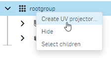
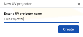
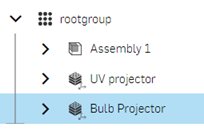
Create UV projector - Available only from the rootgroup or Face parent group, use this option to create a UV projector instance below the rootgroup or Faces parent group list item. See Assigning a UV projector instance to a part for more information.
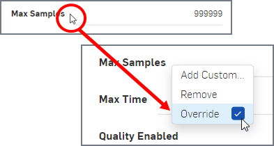
Setting a parameter override
Override any parameter in the Selection panel using this method:
-
In the Scene graph, select the top level item to set the override: for example, rootgroup, or the Part Studio or Assembly.
-
In the Selection panel, place the mouse pointer in the white space between the label and the entry field (the underline in the example here).
-
Right-click and enable the Override checkbox. Disable the override at any time by removing the check from this box.
Assigning a UV projector instance to a part
Each part imported into a Render Studio scene has its own associated UV projector instance. Any settings applied to this instance affect the part only. While only one UV projector instance is applied to one part at a time, create multiple UV projector instances to test out setting variations on the part.
To associate a UV Projector to a part:
-
Right-click on rootgroup in the Scene graph and select Create UV projector (shown in the first image below). Enter a name for the projector in the New UV projector dialog, and click the Create button (shown in the second image below). The UV projector instance is added to the bottom of the Scene graph (shown in the third image below):
-
Select the part in the Scene graph (Bulb <1> in the image below), and then drag the UV projector from the Scene graph and drop it on the Active Projector field in the Projector submenu in the Selection panel:
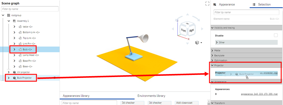
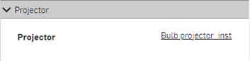
-
The UV projector is added to the Projector field. Click the Bulb_projector_inst link (shown in the first image below). The Projector submenu opens, where a Projector function or Texture space setting is applied (shown in the second image below):
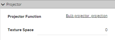
-
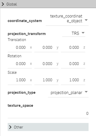
Click on the Projector function link (Bulb_projector_projection). The Global submenu opens, where a coordinate system is selected and the projection transformed (Translation in space, Rotation angle, and Scale sizing).
Add as many UV projectors to the group in the Scene graph and then apply as many of them to as many parts as necessary. Build up a collection of UV projector variations that are easily applied to any part at any time.
Once created, UV projectors cannot be deleted.
Graphics area
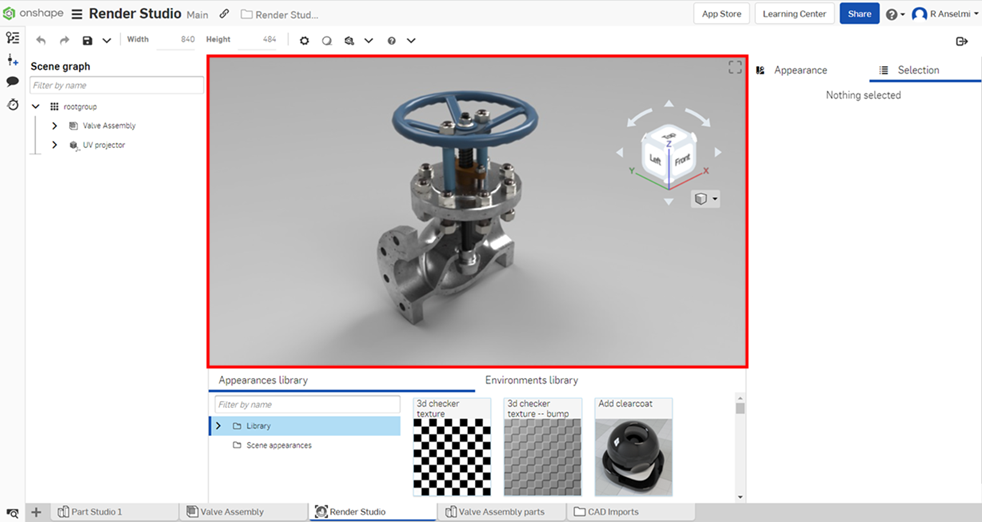
The Graphics area is where the scene is visually located. It appears in the center of the Render Studio application, outlined in red below:
View navigation (View cube and View tools)
The view navigation in Render Studio shares many of the same features as those found in Part Studios and Assemblies. For information on View cube navigation and usage, see View navigation and viewing parts.
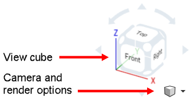
View tools
Render Studio View tools options are:
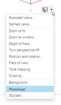
-
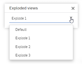
Exploded views - If the model has one or more associated Assembly exploded views, access and switch between them here:
-
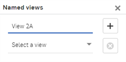
Named views - Save a model position and view with an associated name, or switch to a saved named view. See Named views for more information.
-
Zoom to fit (shortcut: f) - Zoom the entire scene into view.
-
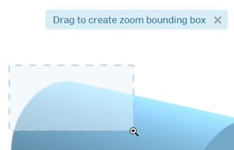
Zoom to window - Select this option, and then create a bounding box that surrounds an area of the scene to zoom into that area. Alternatively, use the "w" shortcut key and then create the bounding box (shown below):
-
Depth of field - Open a dialog to set the view's depth of field, controlling the location and distance from sharp in-focus areas to blurry out-of-focus areas:
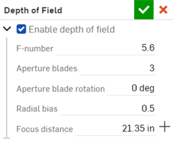
Depth of field options are:
-
Enable depth of field - Turn on the depth of field for the scene and access the other options in the dialog. Simulate the depth of field of a camera. Regions out of focus become blurred based on their distance from the lens and lens properties.
-
F-number - Focal ratio or F-stop number. The ratio of the focal length to the diameter of the aperture of the lens. Smaller values give shallower depth of field (more blurring in out of focus regions). Larger values give narrower depth of field (less blurring in out of focus regions).
While Aperture numbers in real cameras follow a standard sequence (f/1.4, f/2, f/2.8, f/4, f/5.6, f/8, f/11, f/16, f/22), enter any value in the range from 0.063 to 64.
-
Aperture blades - Specify the number of aperture blades, which changes the shape of small, strong highlights in out of focus regions. For values between 0 and 2, highlights are circular. For values between 2 and 20, this activates a blade-shaped aperture with the specified number of blades. For example, a value of 5 results in pentagram-shaped highlights, while a value of 3 results in triangular-shaped highlights.
-
Aperture blade rotation - Available only when the Aperture blades value is greater than 2. Controls the rotation of the aperture blades, which also rotates the shape of the out of focus highlights. The value is entered in radians.
-
Radial bias - Control the bias of the lens system. At 0.5 the lens is treated uniformly. Values between 0 and 0.5 increase the importance of the edge of the lens, darkening the center of out of focus highlights. Values greater than 0.5 increase the importance of the edge of the lens, brightening the center of out of focus highlights.
-
Focus distance - Specify the distance from the lens where the resultant image is in focus. Objects further than or closer than this distance become progressively out of focus.
Click the crosshair button (
 ) to the right of the Focus distance entry to pick the focus point of the object, then use the cross-hair cursor to click an area of the scene to set as a focus point.
For example, in the left image below the larger front end of the part is selected as the focus point, and the front end remains in focus. As you move toward the back end, the background becomes increasingly out of focus. In the right image below, the reverse is true. The part's smaller back end is selected as the focus point. The background is in sharper focus. As you move toward the front end, the foreground becomes increasingly blurry:
When enabling depth of field, make sure the camera position is final. Adjusting camera position after enabling depth of field requires a reset of the focus point and a re-evaluation of the F-stop number.
-
-
Turn perspective off/on - Toggle perspective view on (default) and off. Perspective view shows the relative distance from the point of view to the model, and creates a vanishing point as the point of view (or imaginary camera) approaches the model.
-
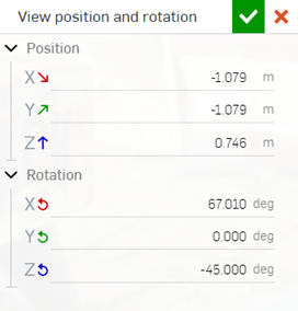
Position and rotation - Opens a dialog to adjust the position (X, Y, Z) and Rotation (X, Y, Z) of the camera numerically. This is useful to precisely match the camera position in two different scenes:
-
Field of view - Open a dialog to specify the Field of view as an angled degree value, from 1.000 to 179.000. Higher numbers produce a wider angled lens, with the vanishing point further from view (sinking into the background). Lower numbers produce a narrower angled lens, with the vanishing point closer in view (at the forefront). This option is only available if Perspective is turned on.
-
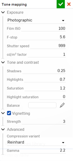
Tone mapping - These parameters provide scene lighting adjustments such as Exposure, Tone and Contrast, Vignetting, and other Advanced attributes. These attributes are physically accurate, simulating how a digital camera takes photographs:
-
Exposure - Select between Photographic exposure, where you select normal camera settings, or Simple exposure, where only a brightness value is input.
-
Film ISO - Film ISO value. Higher values make the camera more sensitive to light. Lower values make the camera less sensitive to light. When set to zero, the shutter and aperture are disabled and have no effect, and all brightness is controlled by the Candela factor. Higher ISO values also increase noise and static in an image. This is common in photography, and can be a desired effect.
-
F-stop - Focal ratio or F-stop number defining the aperture, or how wide the lens opens, for the purpose of tone mapping. This value does not affect depth of field. This value has no effect when Film ISO is set to 0. The smaller the F-stop value, the larger the lens opens. This allows more light into the scene, and makes the scene brighter.
-
Shutter speed - In photography, the shutter speed is the length of time the aperture remains open, exposing the film to light. The Shutter speed parameter is defined as the camera shutter time expressed as fractional seconds; for example, a value of 100 defines a camera shutter of 1/100. This value has no effect when Film ISO is set to 0.
Increasing this value creates a smaller fractional value, allowing less light to enter the scene, and making the scene darker. Decreasing this value creates a larger fractional value, allowing more light to enter the scene, making it brighter. A value of 0 allows no light into the lens, creating a black scene.
-
cd/m2factor - Conversion factor between pixel values and candela per square meter; the unit of luminous intensity in the scene. When Film ISO is set to zero, this becomes a direct multiplier.
-
Exposure (Simple exposure) - The overall exposure of the scene. Smaller or negative values are used for dimmer scenes, while larger positive values are used for brighter scenes. For example, -6 would be suitable for a scene at night with no moon, while 15 would be suitable for a bright sunny day.
-
-
Tone and contrast
-
Shadows - Higher values darken the shadow regions of the image. Lower values bring out more detail in shadow regions.
-
Highlights - Higher values brighten highlight regions of the image. Lower values compress highlights and reduce their contrast.
-
Saturation - Compressing bright color components inherently moves them toward a less saturated color. Sometimes, very strong compressions can leave the image in an unappealingly desaturated state. The saturation parameter allows an artistic control over the final image saturation. 1.0 is the standard, unmodified saturation. Higher values increase saturation, making the colors richer. Lower values decrease saturation, dulling the colors.
-
Highlight saturation - Controls the saturation of highlight areas which tend to look more realistic when desaturated. However, this also changes the color of highlight regions, which is not strictly accurate. Increasing the saturation restores the color of highlight regions.
-
Balance - The color which corresponds to white in the output image. This can be used to compensate for lighting effect.
-
-
Vignetting - In a real camera, the angle at which the light hits the film impacts the exposure, causing the image to be darker around the edges. Vignetting simulates this effect. Note that the field of view of the camera affects how much vignetting is visible. Vignetting has no effect for orthographic views.
-
Strength - At 0.0 no vignetting is visible. Higher values cause stronger darkening around the edges. A good default is 3.0, which is similar to what a compact camera would generate.
-
-
Advanced
-
Compression variant - Determines which tone mapping compression algorithm to use: Reinhard, Uncharted 2, or ACES unreal 4.
-
Gamma - Applies a display Gamma correction. If the image is displayed as-is, without further post-processing by the application, this value should be set to match the display's characteristic. Otherwise, a setting of 1 disables Gamma correction.
-
-
-
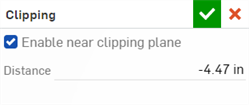
Clipping - Parameters related to the Camera's clipping plane:
-
Enable near clipping plane - When enabled, objects between the camera and the specified distance are not visible or may be partially clipped out.
-
Distance - The distance from the camera before which objects are not visible.
-
-
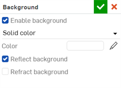
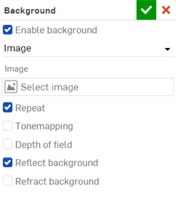
Background - Opens the background dialog. Edit the following parameters:
-
Enable background - Replaces the background environment with a solid color or a custom image. When disabled, the Environment from the Environment library is used (Standard environment is the default).
Solid color:
-
Color - Shows the color swatch used for the background. Click the pencil icon to edit the color used from the color picker. Colors can be selected visually by clicking on the color area, by entering a hex or RGB value, or by selecting a swatch at the bottom of the picker.
-
Reflect background - Enable to allow the background to be seen in reflections of the ground instead of the environment.
-
Refract background - Enable to allow the background to be seen through perfectly specular, non-thin-walled objects.
Image:
-
Select image - Opens the Select image dialog, where an image can be selected from the current document, other documents, or imported from your computer. See Adding a custom background to a scene section for more information.
-
Repeat - When enabled, if the background does not fill the image, then it will repeat in those areas. When disabled, those areas are filled with a solid color of your choice. This also affects the background when visible in reflections, so if this option is disabled, you may see the solid color in the reflections of the background.
-
Tonemapping - When enabled, the background image undergoes the same tonemapping as the scene; useful if the background is a high dynamic range image (HDRI).
-
Depth of field - When enabled, the depth of field is applied to the background; useful to make the background look out of focus if it was not already photographed that way.
-
-
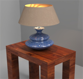
Photoreal - This mode produces a realistic render of the model in the scene. Photoreal (default) and Stylized are mutually exclusive; selecting one turns off the other. Photoreal is recommended for most scenes, unless performance is an issue.
-
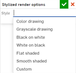
Stylized - This mode produces a stylized render of the parts in the scene. Stylized and Photoreal (default) are mutually exclusive; selecting one turns off the other. When selected, the Renderer options dialog opens where Style variations are selected (shown in the first image below), and additional custom settings when Custom is selected (shown in the second image below):
-
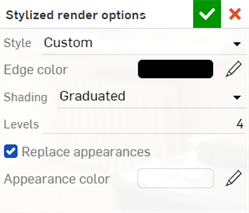
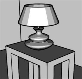
Style - Select from alternate preset style options: Color drawing, Grayscale drawing, Black on white, White on black, Flat shaded, Smooth shaded, and Custom. When Custom is selected, additional settings are available for the parts in your scene:
-
Edge color - The color of the outline drawn around parts in the scene.
-
Shading - Select from Smooth, Flat, or Graduated shading. Smooth provides the appearance of smoothly variegated lighting. Flat provides a uniform color across each part. Graduated provides a more cartoon-like stepped appearance.
-
Levels - Number of shading bands. More levels provides smoother shading, while less provides a more cartoon-like stepped appearance.
-
Replace appearances - Replace the color of all parts in the scene with a single color.
-
Appearance color - Shows the color swatch used for the appearance. Click the pencil icon to edit the color used from the color picker. Colors can be selected visually by clicking on the color area, by entering a hex or RGB value, or by selecting a swatch at the bottom of the picker.
Photoreal
Style: Color drawing
Style: Grayscale drawing
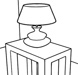
Style: Black on white
Style: White on black
Style: Flat shaded
Style: Smooth shaded
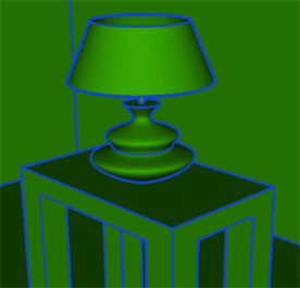
Style: Custom
Edge color: Hex 4A90E2;
Shading: Smooth;
Replace appearances: enabled;
Appearance color: Hex 7ED321
-
Graphics area context menu
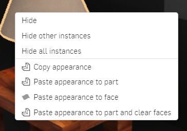
When a part or surface is selected in the Scene graph or the graphics area, a yellow outline is placed around it. Right-click on the part to open a context menu with the following options:
Hide - Hides the selected instance.
Hide other instances - Hides all instances other than the one selected.
Hide all instances - Hides all instances, both selected and unselected.
Copy appearance - Copy the appearance to the clipboard.
Paste appearance to part - Only available if an appearance is first copied to the clipboard. Paste the (previously copied) appearance from the clipboard to the selected part. If the appearance is copied from the Appearances library, a new appearance is created from the copied appearance and assigned to the part. If the appearance is copied from another part or face, or from an appearance in the Scene appearances folder, the part the appearance is copied into references the copied appearance, without creating a new appearance.
Paste appearance to face - Only available if an appearance is first copied to the clipboard. Paste the (previously copied) appearance from the clipboard to the selected face. If the appearance is copied from the Appearances library, a new appearance is created from the copied appearance and assigned to the face (the new appearance is found in the Scene appearances folder). If the appearance is copied from another part or face, or from an appearance in the Scene appearances folder, the face the appearance is copied into references the copied appearance, without creating a new appearance.
Paste appearance to part and clear faces - Only available if an appearance is first copied to the clipboard. This is the same as Paste appearance to part (see definition above), but with the additional prerequisite that any attribute lower down in the Scene graph takes precedence and remains visible.
To apply one appearance to multiple parts, copy and paste the first appearance from the Appearance library to the first part. Then copy the Appearance from the part in the graphics area and paste that appearance to the next part. This ensures only one appearance is created in the Scene appearances folder.
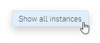
If some or all instances are hidden, with nothing selected, right-click in the graphics area and select Show all instances. All instances are displayed.
Maximizing the graphics area
 Located at the top right corner of the graphics area, click this icon to maximize the graphics area full screen and hide all surrounding panels. Click the icon again to reduce the graphics area size and reveal all surrounding panels.
To adjust the Scene graph or Appearance/Selection panel width or the Appearances/Environments Libraries panel height, hover the cursor over a panel edge. When the cursor turns into a double-sided arrow, click and drag to resize the panel.
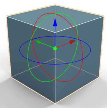
Using the transform manipulator
Use Alt/Option+Shift+select a part/Part Studio/Assembly to access the transform manipulator. The selection is made in the Scene graph or directly on the part in the graphics area. Click on the part, Part Studio, or Assembly, or press the spacebar to hide the manipulator.
To transform multiple parts simultaneously, first hold Alt/Option+Shift, and click to select the first part from the Scene graph or graphics area. The transform manipulator is activated. Now, with Alt/Option+Shift still held down, select additional parts to add them to the transform group. All subsequent transformations apply to all selected parts as a group.
When opened, the origin point is shown as the central green circle. The axes are displayed as both arrows and circles: red for the x axis, green for the y axis, and blue for the z axis.
Perform the following actions with the manipulator:
-
Click and drag on the origin point to move the part, Part Studio, or Assembly freely along any axis.
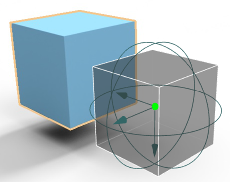
Moving the box freely along any axis.
-
Click and drag on a manipulator arrow to move the part, Part Studio, or Assembly either direction along its axis.
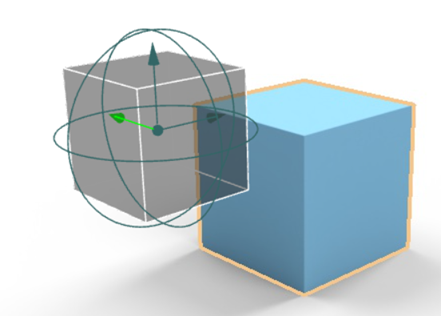
Moving the box along the y (green axis) via the green arrow.
-
Click and drag on the manipulator circle to rotate the part, Part Studio, or Assembly along its axis around the origin point.
Rotating the box along the y (green axis) via the green circle.
Appearances library
Located at the bottom of the page, the Appearances library contains all the standard attribute combinations that are applied to parts, part faces, or surfaces, to provide a material texture, as well as functions that are applied to appearance parameters:
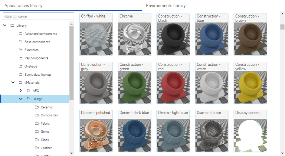
Use the Filter field to narrow the appearance results in the library. The filter only locates appearances within the selected folder. For example, in the image above the Design folder is selected. Type a keyword into the Filter field (where it says Filter by name) and press the Enter key. The search is limited to appearances inside the Design folder. Use "and", "+", and "or" operators between words to further refine the search filter.
Once filtered, results appear as a thumbnail list on the right side of the Appearances panel. To clear the filter, delete the keyword(s) in the Filter field and press the Enter key.
See Render Studio Libraries for a complete list of all appearances and appearance functions.
Tips
-
Refer to the Render Studio Libraries and use the browser search (Ctrl+F) to locate the appearance in the Appearance library or Appearance library - functions tables. These tables provide a short description of each appearance.
-
If an appearance cannot be assigned to a part (the context menu options are not available or do not display when using drag and drop to apply an appearance to a part), it probably means the appearance is a function. Functions must be applied to appearance parameters in the Appearance panel (via drag and drop). See Using Appearance functions for more information.
-
Once an appearance is applied to a part, Part Studio, or Assembly, check the Appearances panel and browse through the appearance's submenus. This panel contains all editable parameter options for the current appearance.
-
If the Appearance panel is empty, most likely there are multiple items selected in the Scene graph or graphics area. Deselect all but one item, and the Appearance panel should populate with applicable parameters.
-
Each appearance parameter in the Appearances panel has an associated tooltip description. Hover the mouse over any parameter for a second to view this tooltip.
-
Some appearances are used to modify other appearances. Drag and drop a modifier appearance on the part or face in the scene, or drag and drop it on the Appearance parameter in the Selection panel. These modifiers do not overwrite the prior appearance. Instead, the modifier is associated to the Base material parameter of the new modifier appearance.
A complete list of modifier appearances are: Add clearcoat, Add cut-outs, Add emission, Add global bumpmap, Add rounded corners, Add sheen, Add simple sticker, Add thermal emission, Add volume, Apply a color falloff, Apply a cover of dust, Apply clear coating, Apply flake coating, Apply thin film, Apply thin metal coating, Surface blender, and Surface falloff.
-
If the appearance is a light source (Add emission, Diffuse light, Photometric light, Spot light), ensure some walls or other parts are modeled so the light has something tangible against which to reflect. If the light is black, increase the Intensity and/or Unit scale parameter in the Appearance panel. See Light emission for more information.
-
If the appearance contains a pattern or texture that does not appear on the part, it might be too small or too large. In the Appearance panel, increase or decrease the Scale parameter. In addition, try increasing the Intensity parameter, if it exists.
-
To adjust the Appearances/Environments Libraries panel height, hover the cursor over a panel edge. When the cursor turns into a double-sided arrow, click and drag to resize the panel.
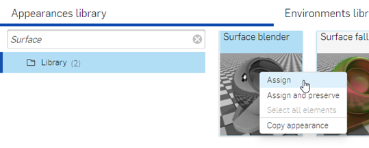
To instead overwrite the prior appearance with the new modifier appearance, select the part or part face in the Scene graph or graphics area, right-click on the modifier appearance thumbnail in the Appearance library and select Assign from the context menu.
Editing a part's Appearance: the basics
When a Part Studio or Assembly is inserted into a Render Studio, it has a base appearance. To edit this appearance:
-
Select the part in the Scene graph or in the graphics area.
-
Adjust any of the following parameters In the Appearance panel submenus:
-
Name - The name of the appearance. This field is editable.
-
Base submenu - Provide base attributes for the part's appearance, which can be edited, including:
-
Reflection anisotropy - The reflections that are caused by the surface against which the part is reflected. These reflections are often blurred or stretched in specific directions. Higher values stretch the highlight, while lower values shrink the highlight.
-
Reflection weight - Control the amount of reflection. Higher values yield stronger reflections, while lower values yield weaker reflections.
-
Metallic appearance - Apply a metallic sheen to the part. With a value of 1, the reflection is colored and independent of view direction. With a value of 0, reflection is white and direction dependent. Directional dependence is based on the IOR (Fresnel effect).
-
Diffuse roughness - Determine how coarse the part's surface becomes, leading to a powdery look.
-
Base color - The part's main color. Click the swatch to select a color from the color picker. Alternatively, enter color (RGB) values in the r, g, and b fields.
-
Anisotropy rotation - The orientation of the part's anisotropy. A value of 1 orients the anisotropy 360 degrees.
-
Reflection roughness - Determine coarseness of the reflections. Higher values lead to more blurry reflections.
-
-
Global submenu - Provide global attributes for the part's appearance, including:
-
Abbe number - Control dispersion. A value of 0 switches dispersion off. Dispersive materials have Abbe numbers between 25 and 85.
-
Bumps - Attach a bump texture or normal map to the part's appearance. Bump textures (or bump maps) simulate the surface texture of a part. Normal maps are a specific type of texture where bump details (wrinkles, grooves, patterned divots, and the like) are added to the model, so that when light is reflected off the surface, real geometry is simulated.
-
IOR - Determine refraction in the volume. It also influences the reflectivity for appearances that are not metallic.
-
Thin walled - Thin walled appearances do not refract and do not have volume effects. Good for soap bubbles or window glass.
-
-
Transmission submenu - Provide light transmission attributes for the part's appearance, including:
-
Volume reference distance - If the appearance is not Thin walled, Volume color (see below) is reached at this distance (m). Enter a typical thickness of objects made of this material.
-
Transmission color - Color effect for transmission, independent of thickness of the object, similar to stained glass. Enter color (RGB) values in the r, g, and b fields.
-
Transmission roughness - Determine the coarseness of the transmission light. Higher values lead to objects seen through the material to appear blurry.
-
Transmission weight - Weight how much light passes through the object, compared to its diffuse reflectivity.
-
Volume color - If the appearance is not Thin walled, Volume color is reached at Volume reference distance (m; see above). Enter color (RGB) values in the r, g, and b fields.
-
The attributes outlined above are displayed when a new part is imported into Render Studio. This is not a complete list of all possible appearance attributes.
Appearances library context menu
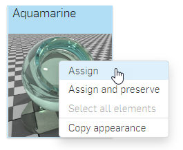
Right-click on an appearance thumbnail in the Appearance library to display a context menu with the following options:
-
Assign - Assign the Appearance to the part(s) and clear any attribute lower down in the Scene graph.
-
Assign and preserve - Assign the Appearance to the part(s) but does not clear any attribute lower down in the Scene graph. Attributes lower down take precedence and remain visible.
-
Select all elements - Selects all elements in the scene with the current appearance.
-
Copy appearance - Copy the current appearance to the clipboard.
Adding an Appearance to a part
To add an Appearance to a part, perform either step 1, step 2, or step 3, below:
Some appearances are functions, and some of those functions cannot be added using the methods outlined below. See Using Appearance functions for more information.
-
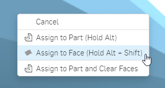
Drag and drop the Appearance on the selected part in the graphics area. A context menu opens with the following three options. Select either option a or c below:
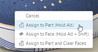
-
Assign to part - The appearance is applied to the part. Any attribute lower down in the Scene graph is cleared.
-
Assign to face - The appearance is applied only to the face under the cursor. Any attribute lower down in the Scene graph is cleared.
-
Assign to part and clear faces - The Appearance is applied to the part. Any attribute lower down in the Scene graph takes precedence and remains visible.
-
-
Select the part or parts (to apply the appearance to multiple parts) in the Scene graph or graphics area. In the Appearance library right-click on the appearance and select from the following context menu options:
-
Assign - Assign the Appearance to the part(s) and clear any attribute lower down in the Scene graph.
-
Assign and preserve - Assign the Appearance to the part(s) but do not clear any attribute lower down in the Scene graph. Attributes lower down take precedence and remain visible.
-
-
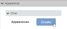
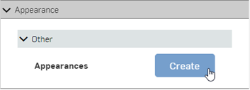
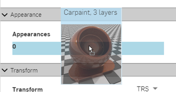
Select the part in the Scene graph or graphics area. On the Selection panel, open the Appearance submenu. Click the Other dropdown and click the Create button (shown in the first image below). Drag and drop the appearance from the Appearance library on top of the Appearance field (shown in the second image below):
 :
:
Adding an Appearance to a part face
To add an Appearance to a part face:
Some appearances are functions, and some of those functions cannot be added using the method outlined below. See Using Appearance functions for more information.
-
Drag and drop the appearance from the Appearance library onto the face of the part.
-
When the context menu opens, select Assign to face:
Alternatively, hold Ctrl+Shift, then drag and drop the appearance from the Appearance library onto the face of the part. This avoids use of the context menu.
Another method is to first select the faces in the Scene graph by clicking on the arrow to the left of the part name. This expands all the part faces. Select the part faces. Then right-click on the Appearance in the Appearances library and select Assign.
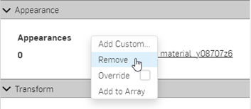
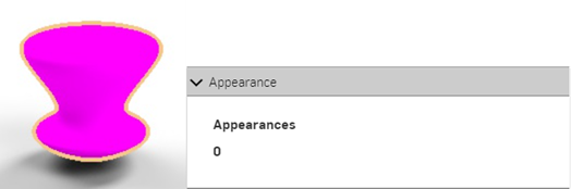
Removing an Appearance
To remove an appearance from a part or part face:
-
Select the part in the Scene graph with the appearance to remove.
-
In the Selection panel > Appearance submenu, right-click on the white space to the right of the Appearance label and select Remove from the context menu.
-
The appearance is removed from the part; the part has a diffuse white appearance.
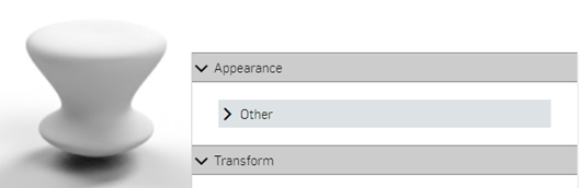
-
To add a new appearance to the part, click the Other dropdown and then click the Create button.
-
The part is displayed with a magenta color to indicate an error (in this case, the appearance function is created, but an appearance is not yet applied).
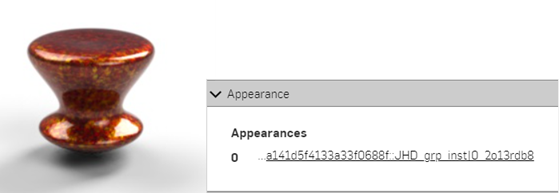
-
Select a new appearance from the Appearance library and drag and drop its thumbnail on the Appearances parameter in the Selection panel.
-
The new appearance is applied to the part. Click the new Appearances link in the submenu to open and edit the appearance parameters in the Appearance panel.
Using Appearance functions
Functions are a special type of appearance that perform a specific action on a part's appearance parameter. When a scene is created, every part has a default set of appearance parameters, viewable in the Appearance panel on the right. See Edit a part's Appearance: the basics for more information.
Tips:
-
Some functions cannot be assigned to parts directly. If the right-click context menu options are unavailable from the appearance thumbnail, or the context menu does not open when the appearance thumbnail is dragged and dropped on the part in the scene, this indicates the appearance is a function.
-
See Appearance library - Functions for a complete list of all functions and a short description of each,
-
Some functions can only be applied to parameters in the Selection panel, and depend on what is selected in the Scene graph.
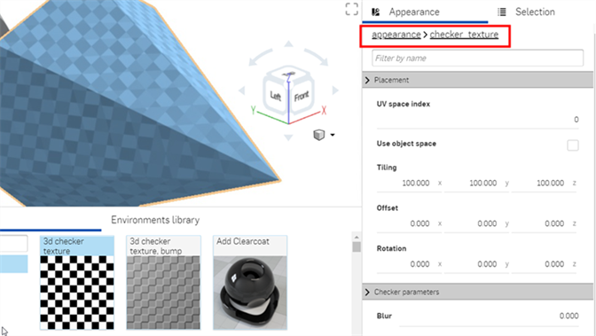
Example 1: 3D checker texture and 3D Checker texture -- bump mapping
To apply a function to the part's appearance parameter:
-
Select the part in the Scene graph or graphic area. The Appearance panel displays the part's default Appearance parameters.
-
In the Appearance library, the first two Appearances, 3D checker texture and 3D checker texture -- bump mapping, are both functions. They are both used in this example. The lower box part in the following model is used for reference:
-
Drag the 3D checker texture over the Appearances panel. Before dropping, notice that many of the Appearance parameters are highlighted in blue. This indicates the 3D checker texture can be applied to any of these parameters. The function is applied to the parameter beneath the mouse cursor. Drop the parameter on the Transmission weight parameter in the Transmission submenu:
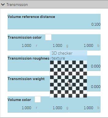
-
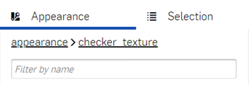
The texture is applied and automatically opens in the Appearances panel. This is verified by viewing the hierarchical breadcrumb trail at the top of the Appearances panel (shown in the first image below). Click on the appearance link in this breadcrumb trail opens the Appearance for the part, where the link to the checker texture next to the Transmission weight parameter is displayed (shown in the second image below).
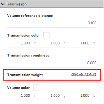
-
The checker texture now acts as a mask for light transmission through the part (the checker texture is the function applied to the Transmission weight parameter of the part's appearance). Anywhere the checker pattern is white, light shows through. Anywhere the checker pattern is black, the base part color shows through. The checker pattern is the part's light transmission mask.
-
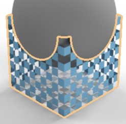
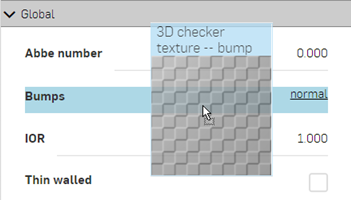
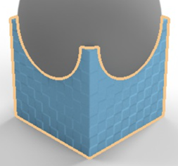
Alternatively, drop the 3D texture -- bump mapping appearance on the Bumps parameter in the Appearance panel's Global submenu. The Bumps parameter is the only one to turn blue, indicating this parameter is the only one that accepts the 3D texture -- bump mapping function:
-
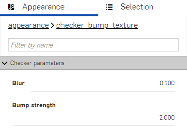
In the example below, the Blur is set to 0.100 and Bump strength to 2.000:
See Add a bump texture and Add a custom bump texture for more information.
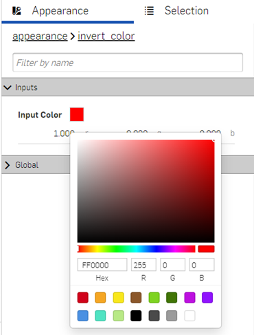
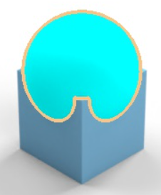
Example 2: Invert Color
The next example applies an Invert color function to the Part's base color. Apply this method to any appearance color parameter, and use it to invert the color.
-
Select the part. In this example, the sphere is selected.
-
Drag and drop the Invert color function on the Base color in the part's Base submenu on the Appearance panel:
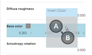
-
The Invert color function opens under the Appearance panel. Click the Input color swatch and select a color. The inverse of that color is used for the Part's base color. In the following example, selecting red creates a cyan base color, since cyan is the inverse of red:
Example 3: Surface blender and Gradient3_texture
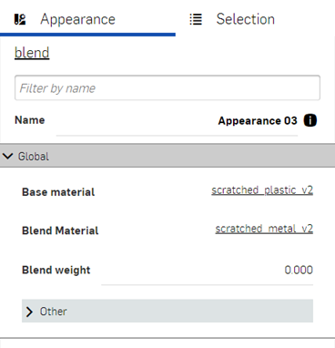
This example uses the Surface blender function to blend between two surface appearances. Once completed, an additional function (Gradient3_texture) is applied to the first function's parameter (the Surface blender's Blend weight). This shows how to build one function on top of another function.
-
Select the part in the Scene graph. In this example a square box is selected and viewed from the top plane. For reference, the box dimensions are .5 m length x .5 m width x .1 m height:
-
In the Appearance library, filter for Surface. Right-click on the Surface blender thumbnail and click Assign (shown in the first image below). The Global submenu in the Appearance panel displays the Surface blender function parameters (second image below):
-
Base material - The appearance on which the blend is based.
-
Blend material - Blend appearance surface properties.
-
Blend weight - Blend weight or mask texture.
-
-
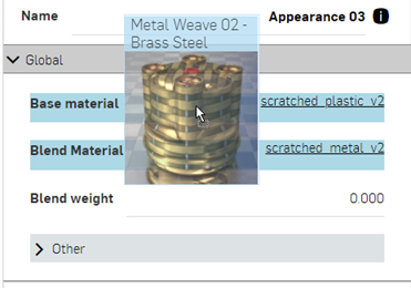
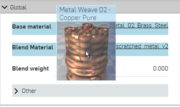
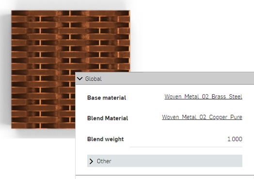
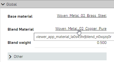
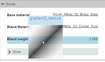
Filter for the Metal weave 02 - brass steel appearance and drag and drop the thumbnail on the Base material parameter (shown in the first image below). Then filter for the Metal weave 02 - copper pure appearance and drag and drop the thumbnail on the Blend material parameter (shown in the second image below). Adjust the Blend weight to 1.000. This blends the colors between the two appearances (the Base material and the Blend material). The result is shown in the third image below:
-
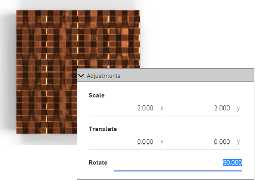
Click on the blend material link to open its parameters in the Appearance panel (shown in the first image below). Rotate the material 90 degrees in the Adjustments submenu. The horizontal pattern is now combined with the newly rotated vertical pattern (shown in the second image below). This better visualizes the blend between the two:
-
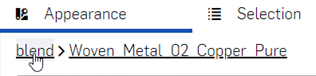
To return to the parent Surface blender layer, click the blend link in the breadcrumb trail at the top of the Appearance panel:
The above procedure works to blend any two surface appearances together. Building on the above procedure, a gradient function is applied to the Surface blender function's Blend weight parameter to blend between the two appearances.
-
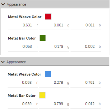
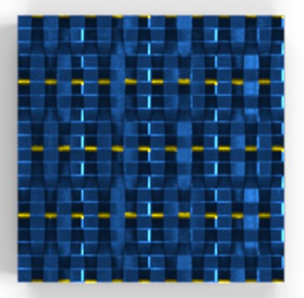
Open the two appearances and change their Weave and bar colors to the following: red and green for the Base material, and blue and yellow for the Blend material. This better visualizes the blends in subsequent steps. The result is shown in the second image below:
-
Return to the parent Surface blender layer. Search for the Gradient3_texture function in the Appearance library, and then drag and drop the thumbnail on the Blend weight parameter.
-
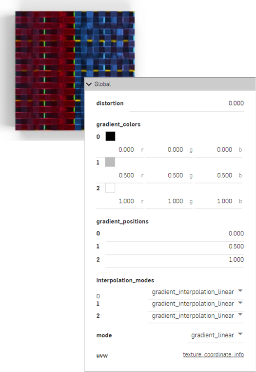
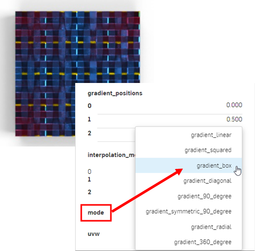
The Gradient3_texture function is now applied to the Blend weight of the Surface blender function's parameter. The gradient is used as a mask between the Base material red and green colors (starting on the left) and the Blend material's blue and yellow colors (ending on the right). Where the gradient is black, the Base material shows through. Where the gradient is white, the Blend material shows through.
Altering the Gradient parameters produces a variety of gradient results that blend between the two appearances. For example, the image below displays the Mode: Gradient_box option (shown in the second image below):
Tips:
-
To blend between two colors, use the Blend colors function and apply it wherever a color parameter is available in the Appearance or Selection panel. Using the blend colors function opens access to layer blending modes that are found in applications like Adobe Photoshop and GIMP (darken, screen, multiply, overlay, and others).
-
To blend between two bump textures, use the Blend normals function and apply it wherever the Bumps parameter is available in the Appearance or Selection panel.
-
Instead of the Gradient3_texture function, use any other texture functions, such as the 3D checkerboard or Cellular noise texture to blend between the two appearances.
-
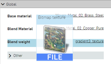
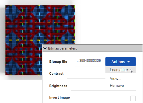
Add a custom texture to blend between the two appearances. Drag and drop the Bitmap texture file on the Blend weight parameter (shown in the first image below), and then load the custom texture (shown in the second image below):
For a tech tip on blends, see Using textures and blends in Render Studio.
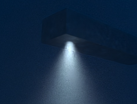
Example 4: Add Volume and Volume coefficient
This procedure explains how to add a specific volume and the Volume coefficient function to a part in the scene. Volume is added as an appearance to the part, while the volume coefficient is a function added to the Absorption coefficient parameter of the appearance.
For this example, a light-emitting ship object is placed in an underwater scene where the water acts as the volume.
-
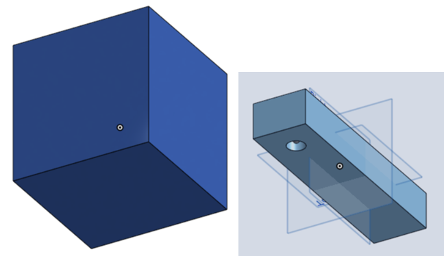
To add volume, the scene must be encompassed by the volume itself. Model a part that surrounds the ship object on all sides, and is large enough to provide sufficient space.
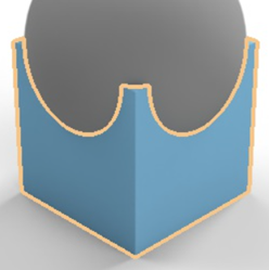
For reference, the surrounding box in this example is 5 m cubed. The rectangular "ship" is 0.6 m length by 0.075 m wide by 0.05 m height. A hole is placed at the front bottom of the rectangle with a diameter of 0.025 and is 0.03 m deep so it does not protrude all the way through the rectangle. Finally, a sphere with a radius of 0.004 m is created inside the hole, which is used as a light source. Each element (part) is referenced as volume, ship, and light source below.
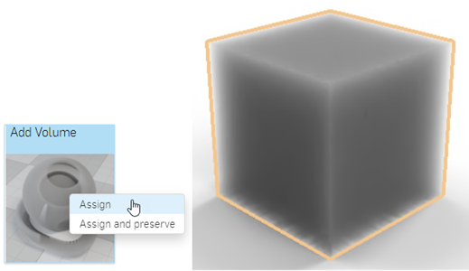
-
In the Scene graph, select the volume. Search for Volume in the Appearances library, right-click on the Add volume thumbnail and select Assign from the context menu. This results in a thick volumetric appearance applied to the surrounding part:
-
Absorption coefficient - The probability density (per meter in world space) of light being absorbed by the participating medium. Default is white (R: 255; G: 255; B: 255). A higher absorption value makes the medium darker, due to more of the light being absorbed as it passes through the medium.
-
Base material - The material onto which the volume is applied. Default is transparent.
-
Directional bias - Influence of light direction on scattering. A value of 0 specifies isotropic scattering, 1 forward scattering, and −1 back scattering. The default is 0.
-
Scattering coefficient - The probability density (per meter in world space) of light being scattered from its current direction. The default is white (R: 255; G: 255; B: 255). A higher scattering value distributes more of the light throughout the medium.
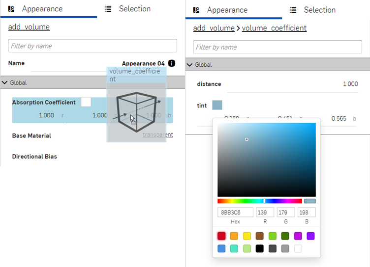
-
Drag and drop the volume_coefficient function on top of the Absorption coefficient parameter in the Appearance panel (shown below left). Then adjust the Tint for the coefficient to R: 139; G: 179; B: 198 (shown below right). This creates a volume of water that contains the ship.
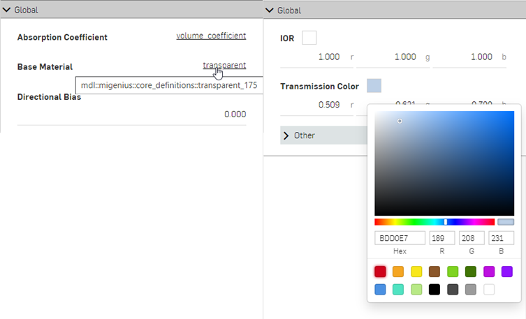
-
Click the transparent link next to the Base Material parameter, and adjust the Transmission color to R: 189; G: 208; B: 231, as shown below:
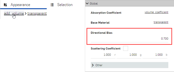
-
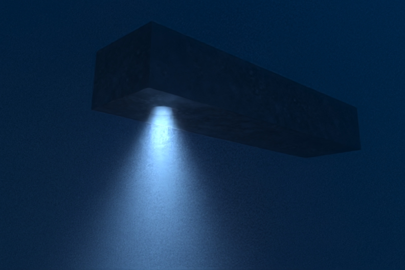
At the top of the Appearance panel, click the add volume link to return to the volume parameters. Set the Directional Bias to 0.700. This lightens the scene, so the ship is visible inside the water:
-
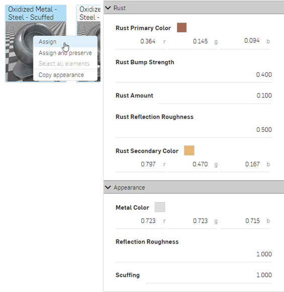
In the Scene graph, deselect the volume part and select the ship part. Locate the Oxidized metal - steel - scuffed appearance in the Appearance library, right-click on the thumbnail and select Assign from the context menu (shown below left). In the Appearance panel, adjust the following parameters: Scale: 2.000 x by 2.000 y; Rust bump strength: 0.400; Rust amount: 0.100; Rust reflection roughness: 0.500; Reflection roughness: 1.000:
-
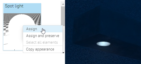
In the Scene graph, deselect the ship part and select the light part. Locate the Spot light appearance in the Appearance library, right-click on the thumbnail and select Assign from the context menu (shown below left). Zoom into the ship to view it from the bottom up. The light is illuminated but is very faint (shown below right):
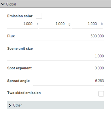
Spot light parameters are:
-
Emission color - Light color. This is rescaled such that it does not influence the luminous flux. The default is white (R: 255; G: 255; B: 255).
-
Flux - The total luminous flux (in lumen) the light emits. The default value is 0.500. It is generally required to increase this value, depending on the scene.
-
Scene unit size - Convert m to scene unit. For example, if 1.0 in the scene is one foot (US customary units), then the scene unit size is 0.30481. The default value is 1.000.
-
Spot exponent - The higher the exponent, the more focused the emission. The default value is 0.000.
-
Spread angle - Spread angle in RAD. Hard limit for the spot spread. The default value is 6.283.
-
Two sided emission - If enabled, emission occurs on the front and backside of the geometry. The default is disabled.
-
-
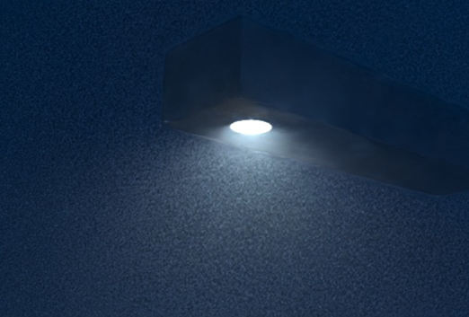
Set the Flux to 20000.000 and Scene unit size to 0.800. The light now emits a higher intensity light, and is diffuse and unfocused:
-
To focus the light to a narrower beam, set the Spot exponent to 15.000 and Spread angle to 2.500:
-
To have the light color blend in with the water, alter the Emission color to R: 157; G: 189; B: 226. Bear in mind that any of these parameters can be adjusted to different specifications. This is one variation on the scene render:
The following outlines the Volume parameters:
Transforming an Appearance
Transforming an Appearance is similar to transforming a part, however, only the appearance is transformed. The part remains static. This example uses a wood table. The wood appearance is transformed to make the table look more realistic.
-
Create an Assembly of a table top and four legs, so there are five assembled parts.
-
Create a Render Studio scene and insert the table Assembly.
-
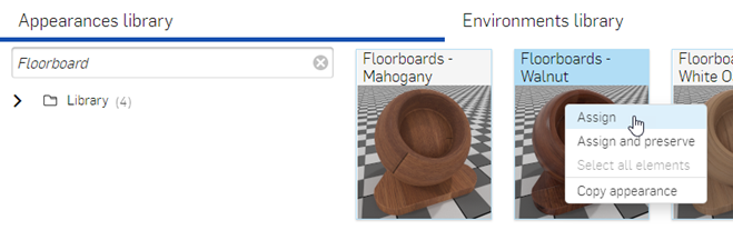
Select the table top in the Scene graph. Filter for Floorboards in the Appearance library. Right click on the Floorboards - Walnut and select Assign from the context menu. The appearance is applied to the table top:
-
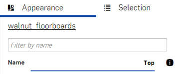
In the Appearance panel on the right, rename the Appearance "Top":
-
In the Scene graph, deselect the Table top, and multi-select (Ctrl/Cmd+Select) the table legs. Right click on the Floorboards - Walnut and select Assign from the context menu. The appearance is applied to all four table legs.
-
Deselect all but one of the leg parts in the Scene graph (it does not matter which one). Select the Appearance panel on the right, and rename the Appearance "Legs".
-
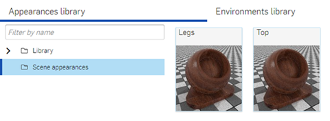
Deselect the last table leg in the Scene graph. In the Appearance library remove all filters from the Filter by name field. Select the Scene appearances folder. Scroll to the bottom of the thumbnail list to reveal the two new appearances:
-
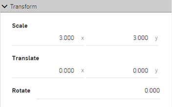
Click on the Top appearance thumbnail to select it. In the appearance panel's Transform submenu on the right, enter a scale of 3.000 x 3.000. This removes the floorboard grooves by translating the appearance pattern larger than the table:
-
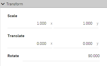
Click the Legs appearance thumbnail in the Appearance library. Enter a Rotation measurement of 90 degrees in the Appearance panel's Transform submenu. This creates vertical planks of wood along the table leg appearance. Since the Legs appearance in the Scene appearances folder is associated with all four legs, they are all transformed simultaneously as a group:
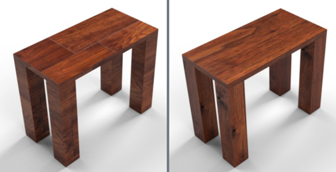
The Table model with default Walnut - Floorboards appearance (left), and after transforming the appearances (right).
Adjustments may not always yield the same results shown in the sample image here, especially with Transform options, which depend largely on model size. The appearance may require a scale larger or smaller than 3.000 x by 3.000 y.
Optionally, for more granular control of Appearance transformations, apply the same or different appearances to each part face and then transform each face appearance separately. To do this, click on the arrow to the left of the part name in the Scene graph to expand all the part's faces. See Add an Appearance to a part face for more information.
Using the Scene appearances folder
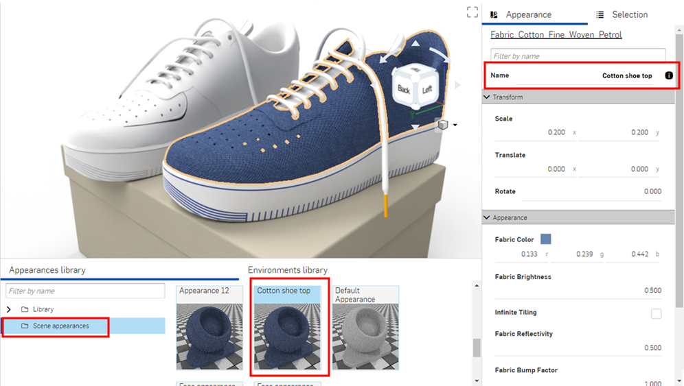
When an appearance is applied to a part or face in a scene, it is placed in the Scene appearances folder at the bottom of the Appearances library folder list. This helps keep track of appearances used in the scene. Apply the same appearance to multiple parts. When any part or face that uses the appearance is selected, and its appearance edited in the Appearances panel, all other parts and faces using the appearance are updated simultaneously. There is no need to individually update each part or face appearance.
-
Add an appearance to a part or a face. In the image below, a blue cloth material appearance is added to one of the shoes.
-
Rename the appearance at the top of the Appearance panel. This helps to locate the appearance in the Scene appearances folder later, especially if the scene is complex, with many appearances.
-
Locate the appearance in the Scene appearances folder in the Appearances library, and apply the appearance to as many other parts or faces in the scene:
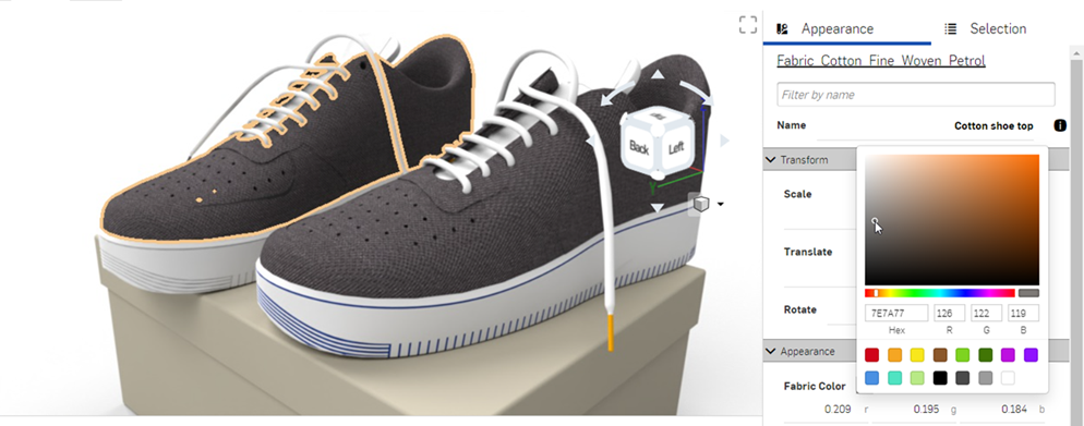
-
Edit the appearance using the Appearances panel. For example, in the image below, the color of the shoe fabric is changed to gray. Notice that both shoes are updated with the new color attribute, even though only one shoe is selected:
Scene appearances context menu
Right-click on an appearance thumbnail in the Scene appearances folder to display a context menu with the following options:
-
Assign - Assign the Appearance to the part(s) and clear any attribute lower down in the Scene graph.
-
Assign and preserve - Assign the Appearance to the part(s) but do not clear any attribute lower down in the Scene graph. Any attribute lower down takes precedence and remains visible.
-
Select all elements - Select all elements in the scene with the current appearance.
-
Rename - Rename the current appearance.
-
Copy appearance - Copy the current appearance to the clipboard.
-
Paste appearance - Only available if an appearance is first copied. Paste the (previously copied) appearance from the clipboard to the existing appearance. The existing appearance is replaced with the copied one.
Adding a texture
Apply a texture to one of the part's appearance parameters. This procedure explains how to apply a texture to the part's Diffuse roughness parameter.
-
In the Scene graph or graphics area, select the part.
-
Expand the Base submenu in the Appearance panel, if it is not already expanded.
-
Click and drag the texture from the Appearances library and drop it on top of the Base submenu's Diffuse roughness parameter.
-
The texture is applied and automatically opens in the Appearances panel. This is verified by the hierarchical breadcrumb trail at the top of the Appearances panel (outlined in red in the image below). Adjust the 3D checker texture parameters to different specifications using the submenus in the Appearances panel:
-
Click the appearance breadcrumb link at the top of the Appearances panel (shown in the first image below) to return to the part's Appearance panel. To edit the texture again, click its link next to the Diffuse roughness parameter (shown in the second image below):
Before dropping the texture, notice that many of the Appearance parameters are highlighted in blue. This indicates the texture can be applied to any of these parameters. Drop the thumbnail on the parameter of choice. See Using Appearance functions for more information.
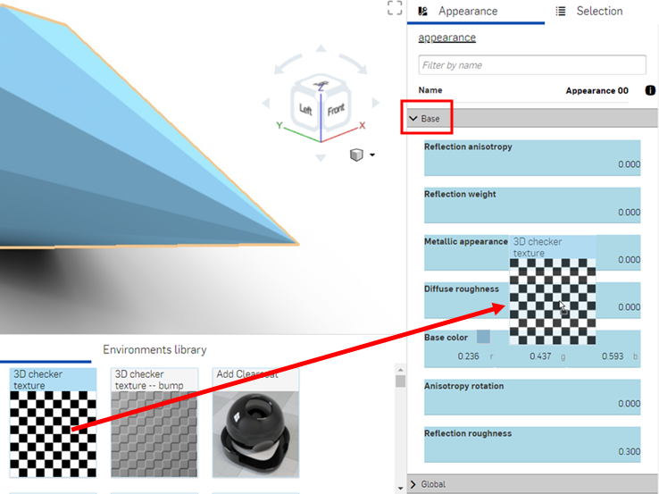
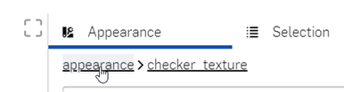
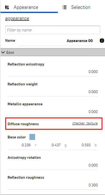
Adding a bump texture
A bump texture (or bump map) simulates a part's surface texture. Normal maps are a specific type of texture where bump details (wrinkles, grooves, patterned divots, and the like) are added to the model. When light is reflected off the surface, real geometry is simulated.
A bump texture is not applied directly to the part. It is applied to the part appearance's Bumps parameter.
-
Select the part in the Scene graph or graphics area.
-
Expand the Global submenu in the Appearance panel, if it is not already expanded.
-
Click and drag the bump texture from the Appearances library and drop it on top of the Bumps parameter.
-
Once applied, adjust the bump texture parameters using the appearance > checker_bump_texture panel submenus:
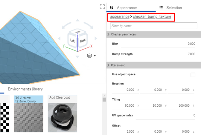
-
Click the appearance breadcrumb link at the top of the Appearances panel (shown in the first image below) to return to the part's Appearance panel. To edit the bump texture again, locate it in the Global submenu and click on its link (shown in the second image below):
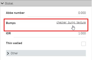
Before dropping the bump texture, notice that only the Bumps parameter is highlighted in blue. This indicates the bump texture can only be applied to this parameter. See Using Appearance functions for more information.
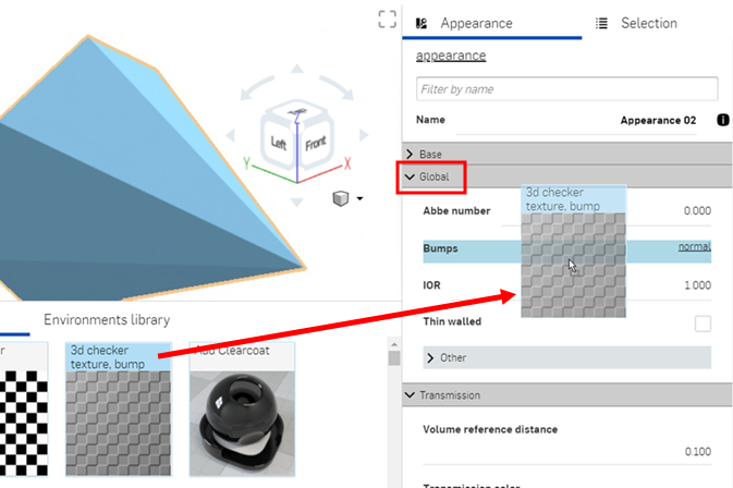
Adding a custom bump texture
A bump texture (or bump map) simulates a part's surface texture. Normal maps are a specific type of texture where bump details (wrinkles, grooves, patterned divots, and the like) are added to the model. When light is reflected off the surface, real geometry is simulated.
A bump texture is not applied directly to the part. It is applied to the part appearance's Bumps parameter.
-
Select the part in the Scene graph or graphics area.
-
Expand the Global submenu in the Appearance panel, if it is not already expanded.
-
In the Appearance library panel at the bottom of the page, navigate to Library > Iray components, or search for file in the Filter field.
-
Locate, then click and drag the Bitmap texture, bump file and drop it on top of the Bumps attribute on the Global submenu.
-
Under the Bitmap parameters submenu, click the Actions button, and select Load file:
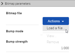
-
Browse and open an image file (.jpg or .png) from the local computer.
-
Use the Bitmap and Placement submenus to edit the bump texture parameters:
-
Tiling - Control the scale of the texture on the part. Larger numbers reduce the texture size (more tiles), while lower numbers increase the size of the texture (fewer tiles).
-
Clip - If enabled, the texture does not repeat and anything outside the texture shows as flat.
-
Offset - Control the position of the texture on the part
-
Rotation - Control the rotation of the texture on the part, in degrees.
-
Bump mode - Define how the texture is evaluated to create the bumps.
-
Bump strength - Control the intensity of the Bump map tiling.
Alternatively, use the file_texture option (shown in the red box below) for more complex texture editing capabilities. Complex graphs of texture placement functions are connected to file_texture maps.
Before dropping the bump texture, notice that only the Bumps parameter is highlighted in blue. This indicates the bump texture can only be applied to this parameter. See Using Appearance functions for more information.
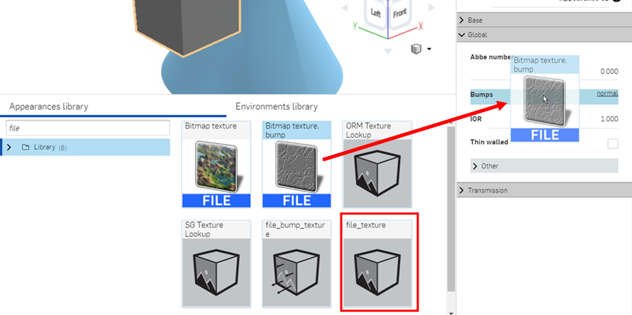
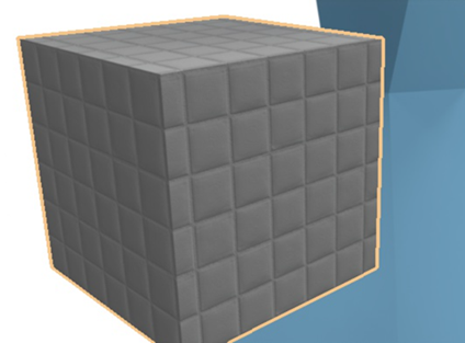
Light emission
There are several appearances devoted to adding and emitting light from a part, surface, or face in a scene. Which light appearance is used depends on the light source and how the scene in question should be lighted. Light emission appearances are outlined below:
| Light Appearance Name | Description |
| Add emission | Adds emission to a material. See Add a light using the Add emission Appearance for more information. |
|
Add thermal emission |
Adds emission to a material, Color is based on a "color temperature". See Add a thermal emission Appearance for more information. |
| Candle 1900k emitter | AEC - Lights - Candle 1900k Emitter. See Additional light examples for more information. |
| Cool white 7000k emitter | AEC - Lights - Cool White 7000k Emitter. See Additional light examples for more information. |
| Diffuse area light | Material for an area light with a diffuse emission everywhere. See Additional light examples for more information. |
| Diffuse light | 2 Appearances: (1) Material for a light with a diffuse emission characteristic and (2) glTF 2.0 diffuse light source. See Additional light examples for more information. |
| Display screen | Design - Lights - Display Screen (Illuminated screen for displays). See Display screen for more information. |
| Fluorescent 5000k emitter | AEC - Lights - Fluorescent 5000k Emitter. See Additional light examples for more information. |
| Halogen 3000k emitter | AEC - Lights - Halogen 3000k Emitter. See Additional light examples for more information. |
| IES light | 2 Appearances: (1) Material for a light with Ies defined distribution characteristics and (2) IES profile driven light material, scaling the original data to yield the specified flux. See Add a custom IES light profile for more information. |
| Mia photometric light |
An implementation of the "Mia photometric light" shader in the MDL. This appearance can also import IES light profiles. Compatibility notes:
See Additional light examples for more information. |
| Natural white 4000k emitter | AEC - Lights - Natural White 4000k Emitter. See Additional light examples for more information. |
| Photometric light | Material for a light source driven by IES photometric profile. Note that for profiles using absolute measurements (e.g., those for LED) the multiplier argument should be set to 1.0. See Additional light examples for more information. |
| Spot light | 3 Appearances: (1) Material for a light with a shaped emission characteristic, (2) Spot light material with global (object orientation aligned) distribution, and (3) glTF 2.0 spot light source. See Add a spot light and reflective surface and Add Volume and Volume coefficient for two spot light examples. |
| Warm white 2700k emitter | AEC - Lights - Warm White 2700k Emitter. See Additional light examples for more information. |
In addition to the above light appearances, add a bloom filter via the Selection panel.
Adding a light using the Add emission Appearance
This is a simple way to add a light emission to any part in the scene:
-
In a Part Studio or Assembly, create a part used as a light source and add some walls around the part. In this example, a light bulb is modeled, with some side walls and a floor:
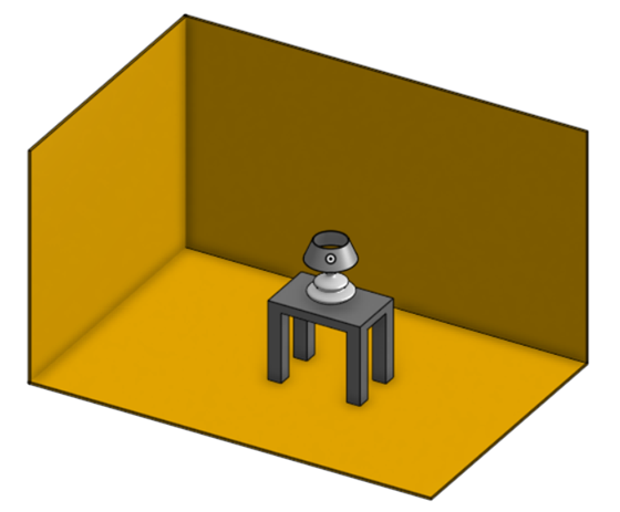
-
Apply a clear coat appearance to the walls, so there are reflective surfaces off which the light emission reflects:
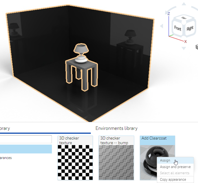
-
In the Scene graph or graphics area, select the bulb's glass cover, then locate and assign the Thin glass appearance. In the example below, metal is applied to the screw base, and copper to the bottom bulb connector. Finally, the lamp, lamp shade, and table are removed, to better showcase the bulb's emission.
-
In the Scene graph, select the part used for the filament inside the bulb (shown in the left image below), then locate and assign the Add emission appearance (shown in the middle image below). The filament appears dark at first (shown in the right image below):
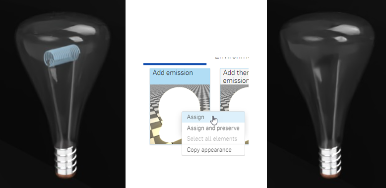
Appearance options are:
-
Base material - The material to which the emission is added. The default is diffuse.
-
Intensity - The brightness of the light source. The default value is 1000.000
-
Color - The light emission color. The default is white (R: 255; G: 255; B: 255).
-
Unit for emission - The physical unit of "Intensity". The default is lumen_m2. Other options are lumen, candela, and nit.
-
Unit scale - The modeling unit to meter conversion factor. The default value is 100.000.
-
-
Adjust the emission Intensity upward. Keep in mind this value depends largely on the scene dimensions. For reference, the dimensions of the room created below are 2.43 m length by .97 m wide by .84 m height. The Intensity value is set to 10000000.000. This creates an emissive white light:
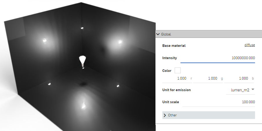
-
Adjust the color to control the warmth or coolness of the light emission. The following example displays how the light emission changes when a new color is selected.
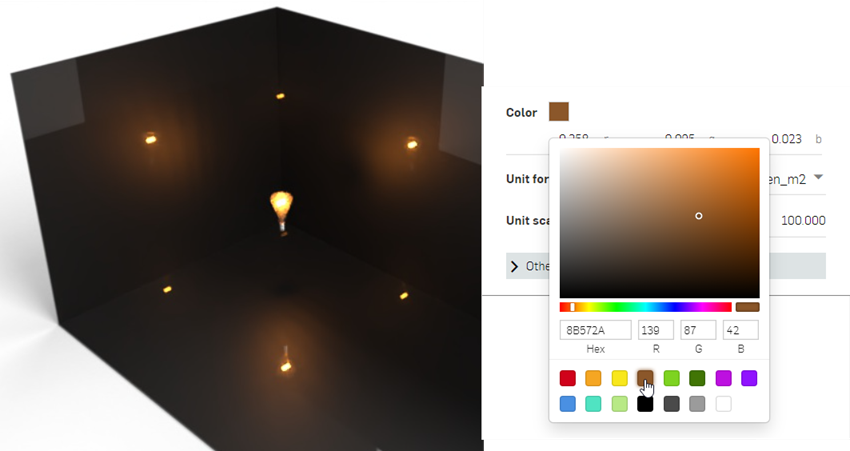
-
Zoom into the bulb, decrease the intensity, and change the color to blue to create the emission shown below:
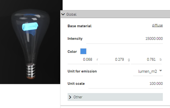
-
The final example shows how the light bulb is used in a completed scene, with the addition of a lamp and table. Note how the shade over the bulb redirects the light emission upward and downward, and dulls the emissions where the shade is set between the light source and the walls.
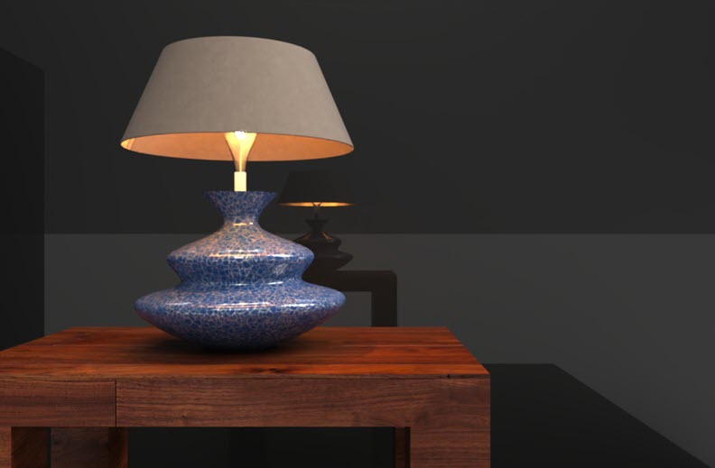
Adding a thermal emission Appearance
Similar to the Add emission appearance, the Add thermal emission appearance adds light to a modeled part, surface, or face. However, the light source is meant to act as a source of thermal heat. The Color parameter is replaced by a Temperature parameter, which is adjusted to define the type of heat source.
-
Once the part is modeled, create a scene from the Part Studio or Assembly. The example used here is a Valve assembly:
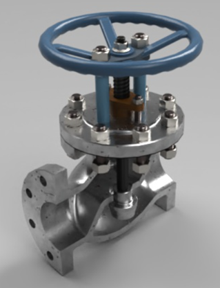
-
Select the part in the Scene graph or graphics area. This is the part used as the thermal emission origin. In the example below, the gasket is used as the emission source:
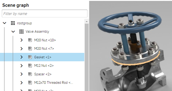
-
Locate and assign the Add thermal emission appearance:
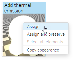
-
Adjust the Intensity upward. For this scene, the Intensity is set to 10000000.000. Then set the Temperature to 2000.000. This creates an orange-colored thermal emission:
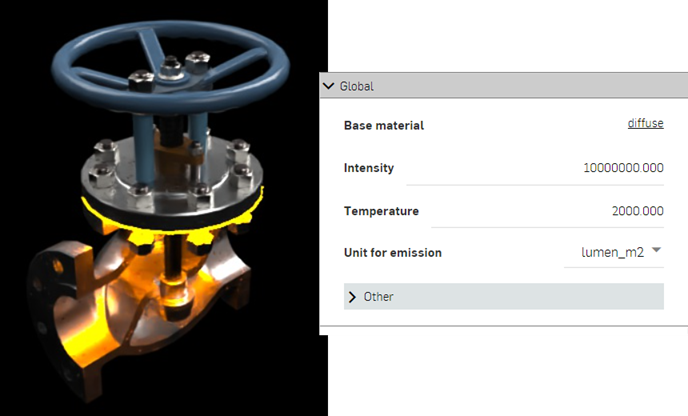
-
Setting the Temperature value to 65000.000 changes the emission color to blue, which is used, for example, to indicate heat from a hydrocarbon source, such as butane or propane gas:
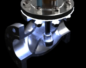
As a general guideline, values from 0 to 3500.000 are in the red-orange-yellow range, while numbers from 10000.000 upward are in the blue range. The default value of 6500.000 emits a white color.
Adding a custom IES light profile
IES light profiles describe the distribution of light from a lamp. This data is provided by many manufacturers so that designers can realistically render light within a room.
An example of several IES profiles.
Render Studio provides the ability to add an IES light profile to a light source.
-
Select the part or face in the Scene graph or graphics area.
-
Filter the Appearance tab for IES. Right-click on the IES light thumbnail, and assign the light to the part or face. The example below is a living room with a very dark environment:
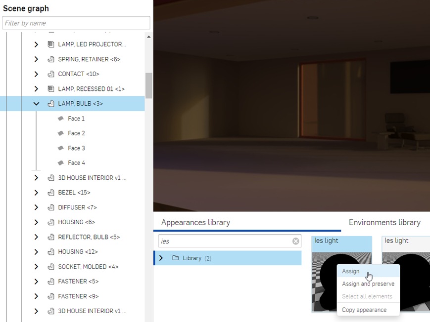
-
Go to the Global submenu in the Appearance panel, click the Actions button next to the Light profile label, and then click Load a file:
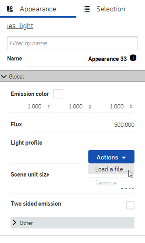
-
Locate and select the custom IES profile. Click the Open button:
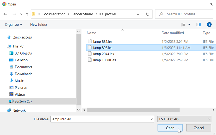
-
Edit the parameters in the Appearance panel submenus. For example, alter the emission color to change the light color, and increase the flux amount to increase the intensity of the light emission (usually to somewhere between 100,000 - 1,000,000, or higher, depending on the environment). In the examples below, the IES profiles are applied to the recessed lights in the living room ceiling:
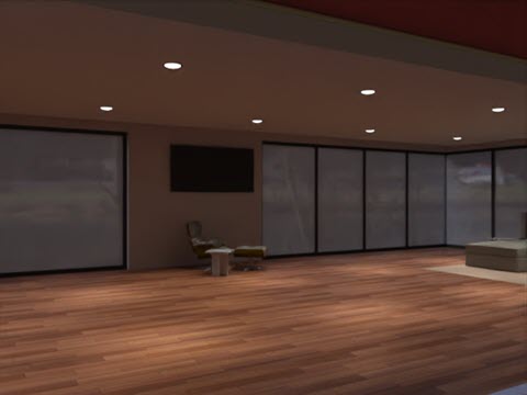
Below are two variations on the lighting. The first image uses an IES profile with a wider emission spread than the example above, while the second image uses an IES profile that emits a halo surrounding the bulbs. The Emission color is set to blue:
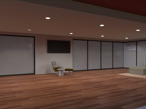
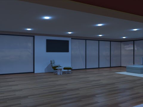
If more advanced options are required, instead of the IES light, apply the Photometric light or Mia photometric light appearance to the part or face. These appearances allow custom IES profile import, but have additional parameter options.
For a collection of free IES profiles, visit https://ieslibrary.com/en/home
Adding a Display screen Appearance
The Display screen is a very specific type of appearance used to replicate an image on a television, computer, or other digital screen. Options are:
-
Scale - Scales the image size along the x and y axes. Larger numbers increase the size. Smaller numbers decrease the size.
-
Translate - Controls the position of the image along the x and y axes.
-
Rotate - The Rotation angle of the image in degrees.
-
Image - The image file mapped onto the display area.
-
Intensity - The display emission intensity. The default value is 40.000. Note that when applying this appearance, the light source will most likely be black. Increasing the intensity to a higher value should yield a sufficient intensity to view the emission. This depends on scene size.
-
Repeat image - If enabled, the image repeats across the UV coordinates. If disabled, a single instance of the image displays across the UV coordinates. The default is enabled.
-
Screen roughness - Higher roughness values lead to bigger highlights and blurrier reflections. The default value is 0.2000.
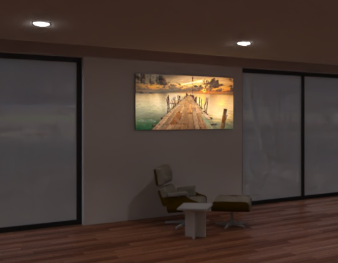
Display screen light example (applied to the front face of the wall screen)
Intensity: 200000.000
Additional light examples
The following lights all use the same base emitter parameters. Only the Color temperature value varies:
-
Color temperature - Color temperature, in Kelvin.
-
Lumens (flux) - The luminous flux, in lumens, the light emits. The default value is 1000.000.
-
Two-sided emission - If true, emission happens on the front and back sides of the geometry. The default is disabled.
|
Candle 1900k emitter
|
Cool white 7000k emitter
|
Fluorescent 5000k emitter
|
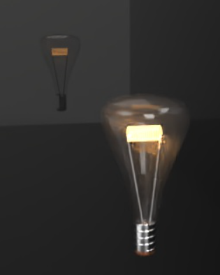
Halogen 3000k emitter
|

Natural white 4000k emitter
|
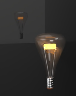
Warm white 2700k emitter
|

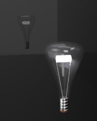
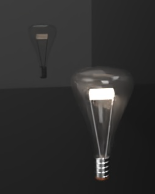
The following are Diffuse light options:
Diffuse area light:
-
Emission color - The color of the light. This is rescaled such that it does not influence the luminous flux. The default value is white (R: 255; G: 255; B: 255).
-
Flux - The luminous flux (in lumen) the light emits in total. The default value is 500.000.
-
Scene unit size - Convert meter to scene unit. Examples: 1.0 in the scene is one foot: Scene unit size = 0.30481.0 in the scene is a centimeter: Scene unit size = 0.01.
-
Two-sided emission - If true, emission happens on the front and back sides of the geometry. The default is disabled.
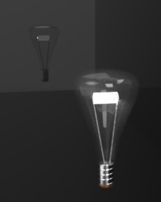
Diffuse light (1):
-
Diffuse light intensity - The intensity of the light. The default value is 1.000. Note that when applying this appearance, the light source most likely shows black. Increasing the intensity to a higher value yields a sufficient intensity to view the emission. This depends on the size of the scene.
-
Intensity is power - If enabled, the intensity is interpreted as power. Consequently, the output is divided by the area of the light source to yield radiance. This means scene brightness stays about the same if the light source surface area is enlarged. The default is enabled.
-
Diffuse light color - The color of the light. This is rescaled such that it does not influence the luminous flux. The default value is white (R: 255; G: 255; B: 255).
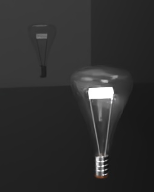
Diffuse light example
Diffuse light intensity: 1000.000
Diffuse light (2):
-
Intensity - The intensity of the light. The default value is 10.000. Note that when applying this appearance, the light source most likely shows black. Increasing the intensity to a higher value yields a sufficient intensity to view the emission. This depends on the size of the scene.
-
Emission color - The color of the light. This is rescaled such that it does not influence the luminous flux. The default value is white (R: 255; G: 255; B: 255).
-
Unit scale - Compensate for scene units other than meter. The default value is 1.000.
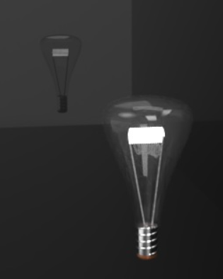
Diffuse light example
Intensity: 1000000.000
The following are Photometric light options:
Photometric light:
-
Absolute profile - Controls whether the intensity is lumen output of the light (disabled) or multiplies the native light output (enabled). The default is disabled.
-
Lumens or multiplier - Light intensity. If Absolute Profile is disabled, then this is the lumen output of the light. If enabled, then this is a multiplier applied to the native light profile intensity. The default value is 2000.000.
-
Intensity is power - If enabled, the intensity is interpreted as power. Consequently, the output is divided by the area of the light source to yield radiance. That means the scene brightness stays about the same if the light source surface area is enlarged. The default is enabled.
-
Additional emission - Used to add a basic Lambertian emission to the light. Useful for avoiding dark light sources when viewed directly. The default value is 0.000.
-
Front emission only - Disables emission on the backface of an area light. This is required for cylindrical lights to prevent illumination from leaking out the open cylinder caps. Technically, this should also be set for spherical lights, even though these lights will not leak. The default is disabled.
-
IES file - The IES light profile used to specify the light distribution. See Add a custom IES light profile for more information.
-
Flip orientation - Reorients the light profiles up vector, which is oriented towards the y direction by default, towards the z direction. The default is enabled.
-
Rotation - Rotates the distribution around the light profiles up vector. The default is disabled.
-
Color temperature - Color temperature, in Kelvin. The default value is 6500.000.
-
Tint - Additional tint color for emitted light (for example, for simulating gels). The default value is white (R: 255; G: 255; B: 255).
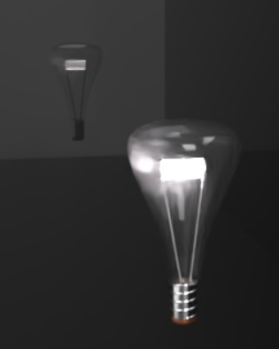
Photometric light example
Lumens or multiplier: 20000.000; Flip orientation: disabled
Mia photometric light:
-
Units to m scale - Scales the scene units to meters. The default value is 1.000.
-
Multiplier - Additional intensity scaling factor. The default value is 1.000.
-
cm2 factor - Scales the scene units to meters. The default value is 1.000.
-
Emulate shader bug - For Distribution mode 2 (light profiles) with Intensity mode 0 or 1 (manual peak intensity, manual flux) the result is incorrectly scaled in the original shader. The default is enabled.
-
Intensity mode - Determines how light intensity is defined: 0 = using a manual peak intensity in candela (cd); 1 = using a total flux in lumen (lm); 2 = using the information stored in the IES file. The default value is 1.
-
Light profile - The IES light profile used to specify the light distribution. See Add a custom IES light profile for more information.
-
Color - Light source color. The default value is white (R: 255; G: 255; B: 255).
-
Spotlight cosine spread - Spread angle in RAD. Hard limit for the spot spread. The default value is 0.000.
-
Manual peak intensity cd - Manual peak intensity for intensity mode 0. The default value is 200.000.
-
Spotlight cosine bias - Defines the focus of the emission. A higher bias results in a more focused emission. The default value is 1.000.
-
Manual flux lm - Manual flux for intensity mode 1. The default value is 300.000.
-
Distribution mode - Determines how light distribution is defined: 0 = Isotropic spherical distribution; 1 = Spotlight distribution; 2 = using the information stored in the IES file. The default value is 0.
-
On - Switches the light on/off. The default is enabled (on).

Mia photometric light example
Multiplier: 20.000
Creating transparency
To create a transparency for a part face:
-
Select the part or face in the Scene graph or graphics area.
-
Filter the Appearance tab for transparent. Right-click on the transparent thumbnail, and assign to the part or face. In the example below, the transparency is applied to the cylinder's front face:
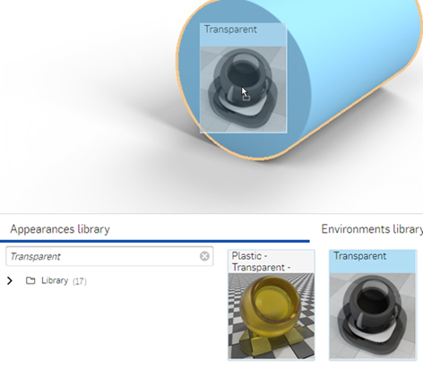
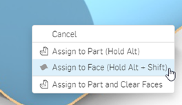
The result is a cylinder that has a transparent front face. The face remains. but is now transparent through to the other faces:
Adding transparency to a part's front or back face can cause the bottom face to disappear (shown in the first image below). This is caused by an incorrectly set ground plane position. To correct this, open the Environment and ground dialog, deselect Automatic height and decrease the Height by .001 (here, it was decreased from -0.088 to -0.089 in the second image below). Alternatively, uncheck the Ground checkbox to disable the ground plane:
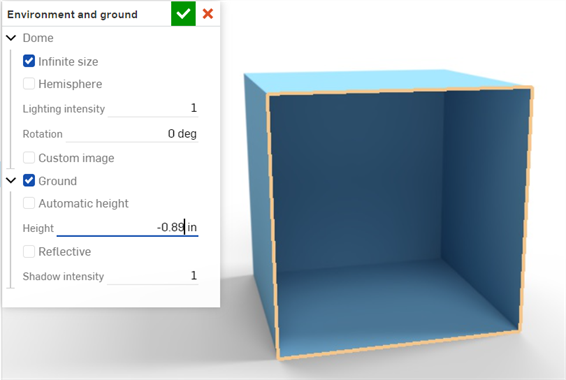
Adding a sticker
A common task is to place a logo or text on a surface or part.
-
Create a model and bring it into a Render Studio scene.
-
Select the sticker face in the graphics area. In the Appearances library, filter on sticker, then drag and drop the Add simple sticker to the face. Select Assign to face In the context menu that opens:
-
In the Appearance panel under the Global submenu, set the Sticker mask to 1.000.
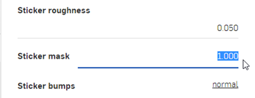
-
In the Appearance library, filter for file. Then drag the Bitmap texture and drop it over the Sticker color. This allows selection of a file to be used for the sticker.
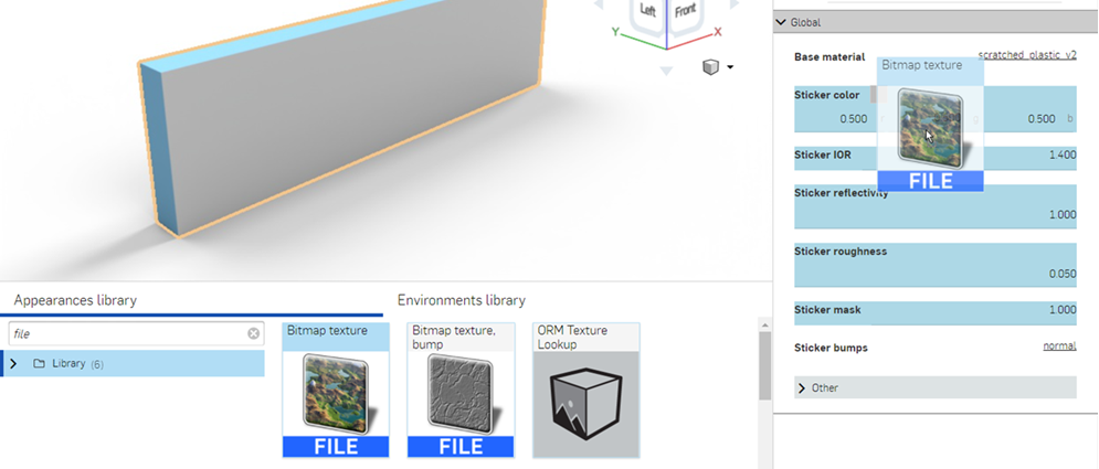
-
Select Actions > Load a file from the Bitmap parameters submenu. Navigate to the file used for the sticker. This is an image file, such as a logo, or text:
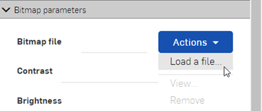
-
Use the Placement options to set up the proper location for the sticker. By default, the Tiling is set to a repeating 1.000 x 1.000, and is not offset nor rotated:
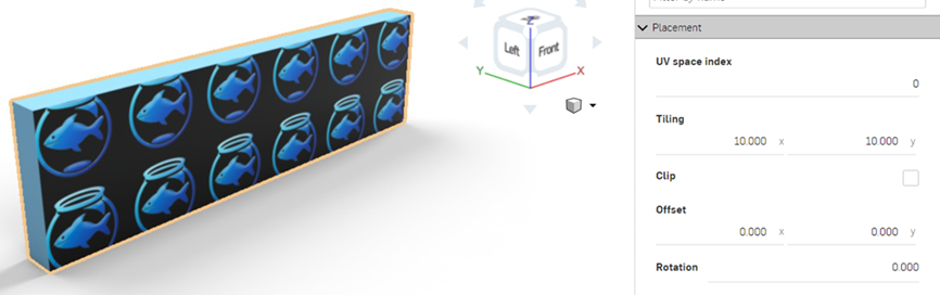
-
Set Tiling to 6.000 x 6.000 to increase the image size, and check the Clip option, which forces the sticker not to repeat. Here, the sticker is also offset to show at the far left of the face. Write down these settings, as they are needed later, when applying a mask.
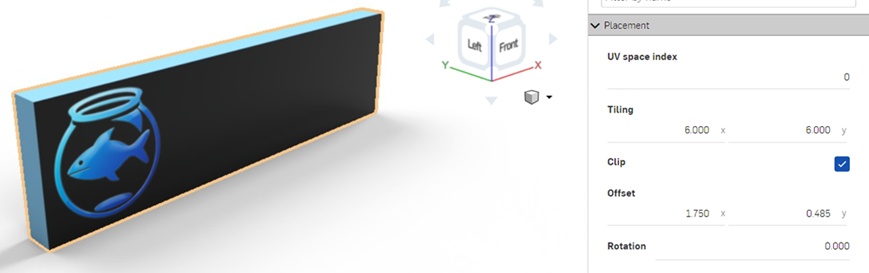
-
At the top of the Appearance panel, click the add_simple_sticker link. This returns the Appearance panel to the parent sticker.
-
Apply the same bitmap file (and settings) to the mask. Drag the Bitmap texture from the Appearances library, and drop it on the Sticker mask in the Global submenu. In the Placement submenu, enter the exact same settings entered previously for the sticker file: Tiling, Clip, Offset, and Rotation.
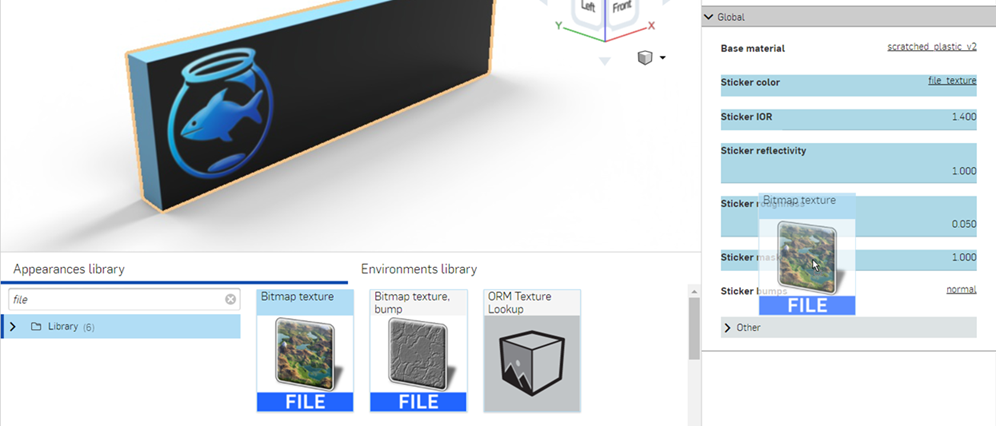
-
Select mono_alpha in the Brightness dropdown in the Bitmap parameters submenu:
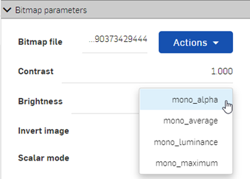
-
The default Base material under the Global menu is scratched_plastic_v2; however, any material can be applied to the face, without affecting the sticker. Locate a material from the Appearance library and drag and drop it on the Base material parameter to add it to the face:
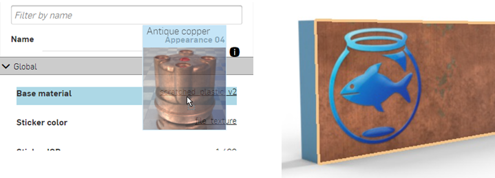
-
If desired, the face can be made transparent, while keeping the sticker in place, as shown below:
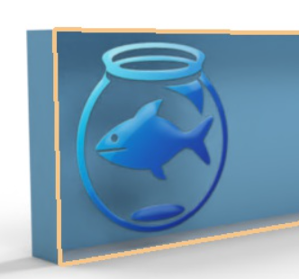
Since even stickers have a small amount of height to them, create a face that is .1 mm in depth above the main face where the sticker is applied when the part is modeled. Then apply the sticker to this face, as outlined below. This creates more realistic sticker edges.
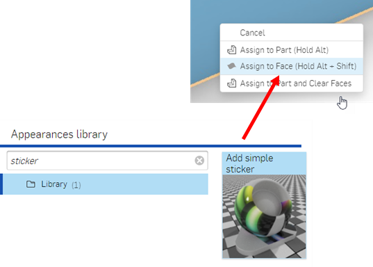
To alter the sticker and/or mask settings, click the Sticker color's file_texture link or Sticker mask's file_texture link, respectively, then adjust the settings. To keep both sticker and mask in sync, both sets of settings need to be updated to match:
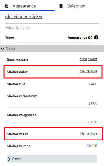
Environments library
Located at the bottom of the page, the Environments library contains all the standard environments that are added as the backdrop for the Part Studio, Assembly, and parts in the scene. An environment also provides scene illumination.
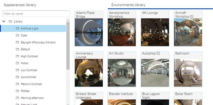
Use the Filter field to narrow the environment results in the library. The filter only locates environments within the selected folder. For example, in the image above, the Artificial light folder is selected. Type a keyword into the Filter field (where it says Filter by name) and press the Enter key. The search is limited to environments inside the Artificial light folder. Use "and", "+", and "or" operators between words to further refine the search filter.
Once filtered, results appear as a thumbnail list on the right side of the Environments panel. To clear the filter, delete the keyword(s) in the Filter field and press the Enter key.
See Render Studio Libraries for a complete list of all environments.
Tips
-
If the Environment is not visible, remove the background. Click the
 View tools icon in the graphics area, select Background, and then uncheck Enable background. Click x in the upper right corner to close the dialog.
-
To hide an environment from the scene, go View tools > Background. and check Enable background. You can additionally select an alternate solid color or image to use for the background.
-
If there is no light source in the scene and/or the scene is completely black, set the Lighting intensity attribute in the
Environment and ground dialog higher. This value varies, depending on the settings established by the enivornment's creator. As a general rule, try a value between 50,000 and 100,000.
-
Each environment parameter in the Selection panel has an associated tooltip description. Hover the mouse over any parameter for a second to view this tooltip.
-
To adjust the Appearances/Environments Libraries panel height, hover the cursor over a panel edge. When the cursor turns into a double-sided arrow, click and drag to resize the panel.
-
When adding a custom Environment, use HDRI images for best quality.
Adding an Environment to a scene
To add an environment:
-
In the Environments panel, select the environment to add to the scene.
-
Right-click and select Apply lighting from the context menu. This only applies environment lighting to the Part Studio or Assembly (the background is kept in place). Alternatively, select Apply lighting and background from the context menu. This removes the background and applies the lighting and environment to the scene:
Alternatively, drag and drop the Environment on an empty area of the scene.
Tips
-
If only lighting is applied, to remove the background later, click the
View tools icon in the graphics area, select Background, and then uncheck Enable background. Click x in the upper right corner to close the dialog. If the scene goes completely black, go back into the Environment and ground dialog and increase the Lighting intensity value to between 15,000-20,000 or higher, depending on the environment image used.
-
If lighting and background is applied, the next time a new environment is applied via the context menu, the Apply lighting option is unavailable. It is only available if a background color is first applied to the scene via the
View tools > Background menu.
Returning to the default Environment
When a scene is created, the default environment (Standard) and background (white) is used. If a different environment is added, do the following to return to this default:
-
Select the Environment panel, and filter for Standard.
-
Right-click on the Standard thumbnail and select Apply (or drag and drop the environment on the backdrop of the scene, not on a scene element, such as a part).
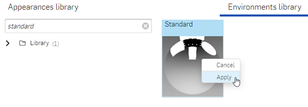
The background color from the environment is used. To optionally revert to the original white background:
-
Click the
View tools menu, and click Background.
-
Select Enable background. By default, the color swatch is white (shown in the first image below). If the color is different, click the
 Edit color icon and select the white swatch from the color palette (shown in the second image below):
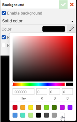
-
Click the
 green checkmark at the top right corner of the dialog to accept your changes and exit the dialog.
Adding a custom Environment to a scene
To add a custom environment to a scene:
-
To apply both the lighting and background of the custom image to your scene, click the
View tools icon in the graphics area, select Background, and then uncheck Enable background. Click the green checkmark to accept and close the dialog. Then follow the remaining steps below. If this step is not performed first, only the lighting from the custom environment image is applied to the scene.
-
Select the Environment and ground icon
from the toolbar.
-
In the dialog, check Custom image and click the Image command:
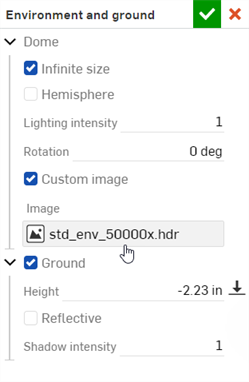
-
In the Select image dialog, locate the image (.hdr or .exr) in the Current or Other documents list, or click the Import button at the bottom to select an image on your computer (see the first image below). Once the image is loaded, click it to use it as the environment image (see the second image below). The lighting of the environment is applied to the scene. Depending on the size of the image, this can take time to load, and may not be seen immediately:
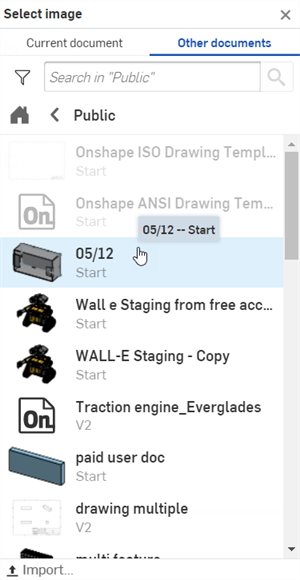
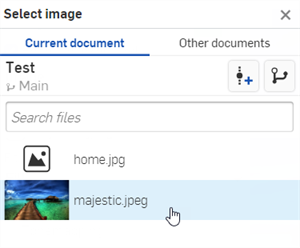
-
If the scene is too dark or black, increase the Lighting intensity value to between 15,000-20,000 or higher. This largely depends on the image used.
Tips:
-
Though .jpg or .png files can be used, for best quality, use HDRI images (.hdr or .exr).
-
For a collection of free environments, visit https://polyhaven.com/hdris,
Adding a custom background to a scene
To add a custom background to a scene:
-
Select Background from the View tools dropdown menu:
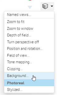
-
In the Background dialog, switch from Solid color to Image, then click the Select image command:
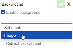
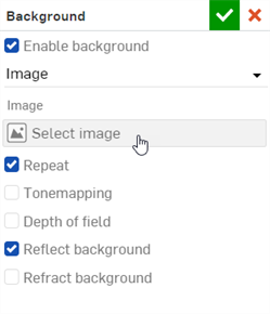
-
In the Select image dialog, locate the image (.jpg or .png) in the Current or Other documents list, or click the Import button at the bottom to select an image on your computer (see the first image below). Once the image is loaded, click it to use it as the background environment (see the second image below). Depending on the size of the image, this can take time to load, and may not be seen immediately:
-
Select any additional options, such as the image Fit (Fill, Fit, or Stretch), Tonemapping, Depth of field, Reflect or Refract background:
Tips:
-
Though .hdr or .exr files can be used, for best results, use .jpg or .png images.
Editing an Environment with location and time
Some environments use location and time to set the sun's location as a light source, which affects the scene's lighting and background. For example:
-
Filter the Environment list for the Preetham environment.
-
Drag and drop the environment over the scene, and select Apply lighting and background from the context menu:
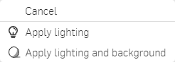
-
Click the
Environment and ground
icon on the toolbar to open the dialog. The scene's location and time settings are located under the Daylight dropdown at the bottom of the dialog:
-
Select City: New York; Date: 07/01/2021; Time: 9:00 AM; and Timezone: UTC-05:00. The sun and shadows now line up for the selected location and time:
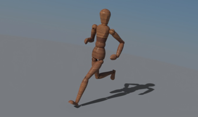
-
Switching to a new time on the same day, for example 4:30 PM, shows a sunset view, with lighting and shadows aligned to match:
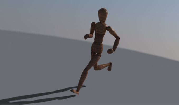
Appearance panel
Located at the right of the page, the Appearance panel displays an editable list of parameters for the appearance of the selected object. Parameters are material-specific (for example, Fabric, Glass, or Masonry), and change parameters depending on the selected Appearance. Filter the appearance by name using the Filter field. The name of the current Appearance is provided below the Filter field.
To adjust the Appearance/Selection panel width, hover the cursor over a panel edge. When the cursor turns into a double-sided arrow, click and drag to resize the panel.
Part Studio Material to Render Studio Appearance mapping
If a Material is assigned to a part in a Part Studio using the standard Onshape Material Library, that material is mapped to a Render Studio Appearance when the part is brought into a new scene. The mapping provides an initial Render Studio Appearance that can be further edited in the scene. Some Render Studio Appearances also use the part's Appearance color (also assigned to a part in the Part Studio), while some do not. For example, ABS material tints the part based on its Appearance color, while Gold material ignores the Appearance color.
If Glass material is applied to the part, the part's transparency is also imported, in addition to its Appearance color.
Tips
-
Scenes saved prior to the Onshape 1.158 release do not have their parts updated with the Material from the Part Studio when the scene is updated or re-saved.
-
If a part's Material is updated in the Part Studio, it is used when the scene is updated in Render Studio, provided the part's Appearance was not previously edited in Render Studio. If the Appearance for the part is edited in Render Studio, the material and appearance mapping connection from the Part Studio is broken.
-
Face Appearances inherit the Material of their part when opened in a Render Studio scene.
-
If 2 parts in a Part Studio have the same Appearance but different Materials, 2 Appearances are created when they are opened in a Render Studio scene.
- If a Material from a Custom library has the exact same name as one from the Onshape Material Library, it is also mapped to its respective Render Studio Appearance.
You can view all scene appearances in the Scene appearances folder in the Appearances library. See Using the Scene appearances folder.
To view all mappings, see the Part Studio Material to Render Studio Appearance mapping table.
Selection panel
Located at the right of the page, the Selection panel displays an editable list of attributes for items selected in the Scene graph or graphics area. Filter the Selection by name using the Filter field. The name of the current Selection is provided below the Filter field. The Element name is the currently selected element in the Scene graph or graphics area:
To adjust the Appearance/Selection panel width, hover the cursor over a panel edge. When the cursor turns into a double-sided arrow, click and drag to resize the panel.
Depending on what is selected, several submenus are visible. In addition, submenu parameter options are also dependent on what is selected in the Scene graph or graphics area. Hovering over a parameter label within a submenu opens a tooltip that provides an explanation of the parameter.
The following table outlines the Selection panel submenus and associated parameters, based on Scene graph or Toolbar selection:
| Scene graph/toolbar selection | Selection panel submenu | Submenu parameter (*Other parameter) |
| Parent group (rootgroup or Section view group) | Visibility and tracing | Disable |
| Visible* | ||
| Matte | Enable* | |
| Shadow intensity* | ||
| Connect to environment* | ||
| Connect from camera* | ||
| Backplate | Use as backplate mesh* | |
| Optimization | Instancing* | |
| Fix shadow terminator* | ||
| Appearance | Appearances | |
| Part Studio / Assembly or Subassembly / Part or Surface / Section view instance | Visibility and tracing | Disable |
| Visible* | ||
| Matte | Enable* | |
| Shadow intensity* | ||
| Connect to environment* | ||
| Connect from camera* | ||
| Backplate | Use as backplate mesh* | |
| Optimisation | Instancing* | |
| Fix shadow terminator* | ||
| Projector | Projector* | |
| Appearance | Appearances* | |
| Transform | Transform (Translation / Rotation / Scale) | |
| Face (mesh) / UV Projector instance | Visibility and tracing | Disable |
| Visible* | ||
| Matte | Enable* | |
| Shadow intensity* | ||
| Connect to environment* | ||
| Connect from camera* | ||
| Backplate | Use as backplate mesh* | |
| Optimisation | Instancing* | |
| Fix shadow terminator* | ||
| Appearance | Appearances* | |
| Transform | Transform (Translation / Rotation / Scale) | |
| Section view (plane) | Sections | Caps enabled |
| Caps color | ||
| Global | disable | |
| mig::display_name | ||
| UV projector | Projector | Projector function |
| Texture space | ||
| Edit options (toolbar) | Progressive rendering | Max Samples |
| Matte fog | Enabled* | |
| Visibility range* | ||
| Visibility tint* | ||
| Brightness* | ||
| Brightness relative to environment* | ||
| Brightness tint* | ||
| Filtering | Pixel filter | |
| Pixel filter radius | ||
| Bloom filter | Enabled* | |
| Radius* | ||
| Threshold* | ||
| Brightness scale* | ||
| AI Denoiser | Available to use | |
| Enabled | ||
| Start iteration | ||
| Denoise alpha | ||
| Iray photoreal | Shadow terminator offset mode* | |
| Maximum Path length* | ||
| White mode | Enabled | |
| Color | ||
| Instancing | Instancing | |
| Spectral rendering | Enabled* | |
| Conversion color space* | ||
| Conversion intent* | ||
| Output transform* | ||
| Observer* | ||
| Matte | Area lights visible* | |
| Shadow affects alpha* | ||
| Visible in auxiliary canvas* | ||
| Remap UV to dome in auxiliary canvas* | ||
| Special samplers | Caustic sampler* | |
| Guided sampling* | ||
| Sections | Caps enabled | |
| Caps color |
Transform options
Transform Part Studios, Assemblies, Parts, and Appearances in Render Studio using the following options:
-
Transform type (TRS or Matrix) - Determines the type of transform matrix used. TRS (Translate, Rotate, Scale) uses a 3x3 matrix, with an x, y, and z axis for each. Matrix uses a 4x4 matrix with an x, y, z, and w axis for each. The additional component equals 1.
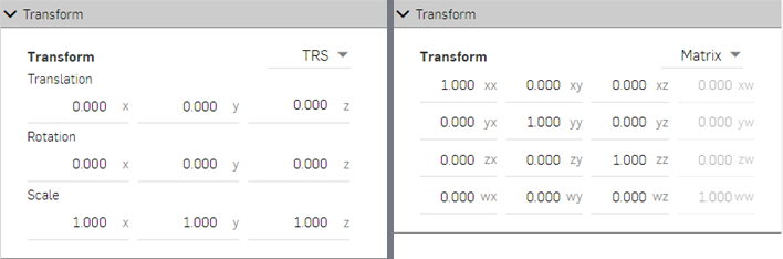
Example of a 3x3 TRS matrix (left) and 4x4 Matrix (right).
Appearances generally have an abridged Transform submenu, with an x and y axis for Scale and Translate, and a single option for Rotation, shown below:
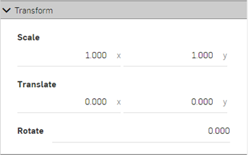
-
Translation - Moves the selection along the x, y, and z axis, according to the origin point of the scene. Measurement units are in meters, and are negative or positive numbers.
-
Rotation - Rotates the selection along the x, y, and z axis, according to the origin point of the scene. Measurement units are in degrees, and range from -360 to +360 degrees.
-
Scale - Scales the selection up (larger) or down (smaller), along the x, y, and z axis, according to the center point of the selection. Measurements are based on the selection's original size. For example, a Scale of 1.000 x by 1.000 y means that the scale is 100% of the part's original size. Fractional numbers from 0.001 to 1 reduce the size of what is selected. Scale axes cannot be set to 0.
When a scene is created from a Part Studio or Assembly, the center of all combined parts is the new origin point (shown as a green circle in the right image below). This origin point is used as the basis for any transformations of the part, Part Studio, or Assembly:
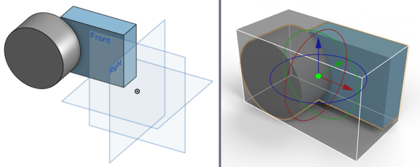
Origin point of a Part Studio in Onshape (left). When brought into Render Studio, the center point of all combined parts is the new origin point.
For information on how to transform an appearance, see Transform an Appearance.
Transforming a part, Part Studio, or Assembly
-
Select the part, Part Studio, or Assembly in the Scene graph or graphics area. For reference, the box seen here is modeled at 1 meter width x 1 meter length x 1 meter height.
-
In the Selection panel > Transform submenu, enter the Translation, Rotation, and Scale amounts numerically. In the examples below, the original box position is shown in gray, and the new location shown in blue:
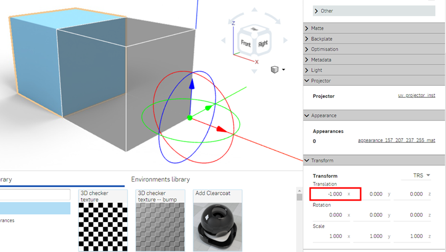
Box translated to -1.000 on the x axis
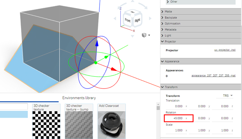
Box rotated 45 degrees on the x axis
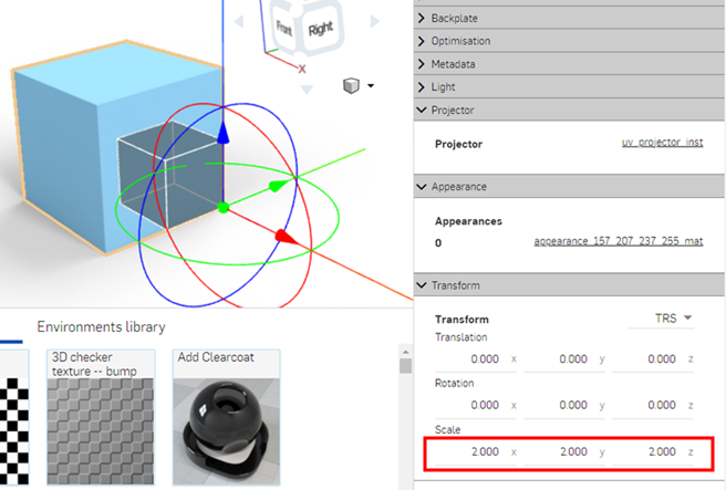
Box scaled to double its original size, 2 x by 2 y by 2 z
For information on how to make transformations to a Part Studio, Assembly, or Part in the graphics area, see Transform manipulator.
Adding and adjusting a bloom filter
A bloom filter approximates the glare and glow around a bright light source.
-
Create a model for the light source. Here, a hollowed out box is used to show light reflections, and a sphere at the center is used as a light source:
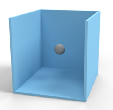
-
Render the scene. Add a metallic appearance for the box part (aluminum_brushed_medium_light).
-
Add a light source for the spherical object (diffuse_light). The background is changed to solid black, to better emphasize the lighting. Global settings for the light are updated to:
-
Diffuse light intensity - 500.
-
Diffuse light color - 0.462 r / 0.680 g / 1.000 b (light blue).
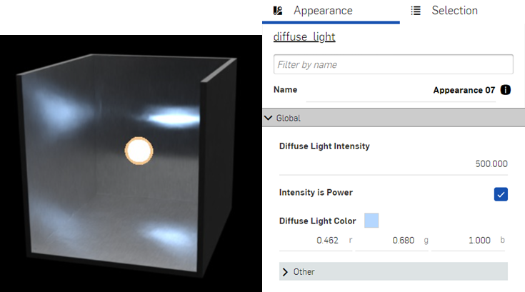
-
-
Deselect everything in the scene. Select Edit options on the toolbar. Navigate and expand the Bloom filter submenu in the Selection panel. Click the arrow to expand the Other submenu.
-
Click Create for each option found in this menu, and adjust according to the settings outlined below:
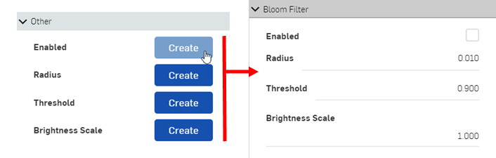
-
Enabled - Turns the bloom on or off. Check this box to turn on the bloom filter.
-
Radius - Controls the size of the bloom. The maximum distance from the bright area where the effect can spread as a percentage of the size of the image. A value of 0.01 (default) means that the maximum spread is 1% of the image size, which is a good starting point. To spread the bloom further outward, increase this value.
-
Threshold - Controls at what brightness the bloom starts. A value of 0.9 (default) is most likely far too low a setting for most use cases, since most of the model usually has a brightness above this value. This results in the model being extremely blurred. Increase the threshold to 8000 as a general starting point. Increase the setting until less blur is seen in the model. Any areas below the threshold are unaffected, while the bloom is applied to those areas above it.
-
Brightness scale - (Optional). Artificially intensifies the effect of the bloom filter in the bright regions. Leave this setting at the default 1.000.
-
The following displays three different bloom setups applied to the scene:
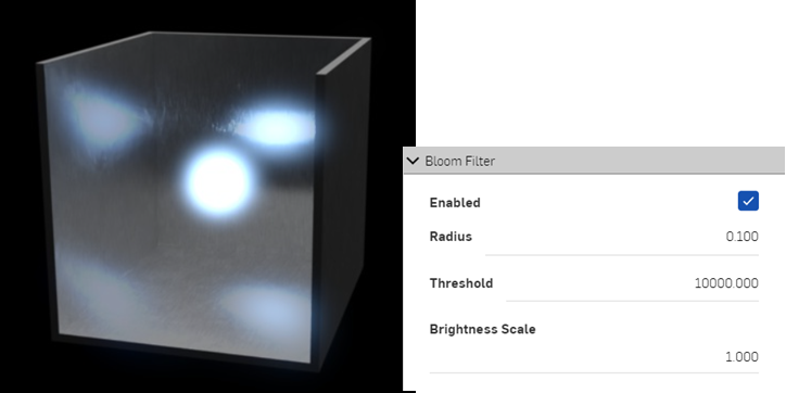
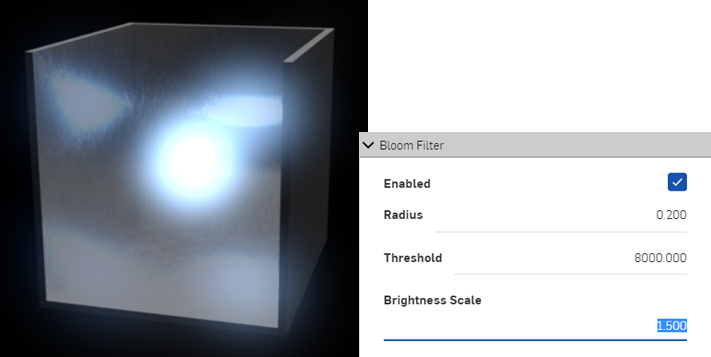
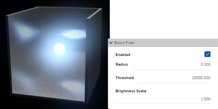
Using White mode
White mode is similar to viewing a clay form of the model, common in many manufacturing design processes. When White mode is enabled, all parts in the scene are shaded using a white diffuse material. This allows the visualization of the parts' curves, without viewing the effects of any light transmission or emissions from the parts. Environment lighting still affects the parts in the scene.
-
Select Edit options on the toolbar.
-
In the Selection panel on the right, expand the White mode submenu. Click the arrow to expand the Other submenu:
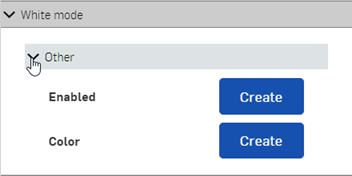
-
Click the Create button for both Enabled and Color parameters.
-
Click the Enabled checkbox:
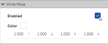
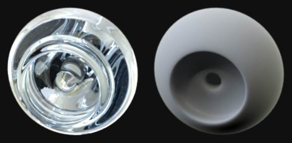
The image at left shows a part with a glass appearance. The image at right is the same part, with white mode enabled.
(Optional) Select an alternate color to use as the base:
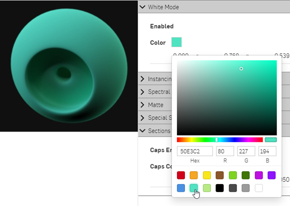
Render options
Render options determine how the scene is output to a .jpg or .png image file. Once scene edits are completed, click the Render to Onshape
icon on the toolbar to open the Render options dialog:
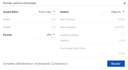
The Render options are outlined below:
-
Aspect ratio - Determine the ratio of width to height for the final output, in pixels. Selections are:
-
From view - Create a render from the current scene's width and height (as reported on the toolbar).
-
4x3 / 16 x 9 - Enter either a Width or Height value below, and the opposing value (width or height) are automatically constrained to either the 4 x 3 or 16 x 9 ratio.
-
Custom - Enter both the Width and Height pixel values independent of each other.
-
-
Format - Select the output format. Options are .jpg or .png.
-
Quality - Select the quality level of the output. Options are, from best to least quality: Production, Medium, and Preview. Custom selection allows the following adjustments:
-
Max time (s) - Maximum time it takes the Render to complete, in seconds. If none of the other conditions have been met by this time, rendering finishes.
-
Max samples - Maximum iteration count. This limits the number of progressive rendering steps to perform. If none of the other conditions have been met when the limit is reached, rendering finishes. Set the value to -1 to have no limit on the number of steps.
-
Quality enabled - When enabled, the render terminates when desired quality is reached. If quality is reached before the Max time or Max samples, rendering finishes early.
-
Quality - The base rendering quality setting. This value roughly linearly affects rendering time. If quality is insufficient, increase this number. The default is 1.0, but this value can be increased.
-
Converged pixel ratio - The ratio of pixels which must have reached the quality specified before rendering finishes. For example, a value of 0.7 means that 70% of the pixels in the image must have reached the right quality before rendering finishes.
-
During the beta period, output is limited to 2.1 megapixels (1920 pixels wide x 1080 pixels high).
Render option settings are remembered from the latest render.
See for Render Studio Examples and Resources for more information.